Clustering Example – Steps You Should Know
This article describes k-means clustering example and provide a step-by-step guide summarizing the different steps to follow for conducting a cluster analysis on a real data set using R software.
We’ll use mainly two R packages:
- cluster: for cluster analyses and
- factoextra: for the visualization of the analysis results.
Install these packages, as follow:
install.packages(c("cluster", "factoextra"))A rigorous cluster analysis can be conducted in 3 steps mentioned below:
- Data preparation
- Assessing clustering tendency (i.e., the clusterability of the data)
- Defining the optimal number of clusters
- Computing partitioning cluster analyses (e.g.: k-means, pam) or hierarchical clustering
- Validating clustering analyses: silhouette plot
Here, we provide quick R scripts to perform all these steps.
Contents:
- Data preparation
- Assessing the clusterability
- Estimate the number of clusters in the data
- Compute k-means clustering
- Cluster validation statistics: Inspect cluster silhouette plot
- eclust(): Enhanced clustering analysis
- K-means clustering using eclust()
- Hierachical clustering using eclust()
Data preparation
We’ll use the demo data set USArrests. We start by standardizing the data using the scale() function:
# Load the data set
data(USArrests)
# Standardize
df <- scale(USArrests)
Assessing the clusterability
The function get_clust_tendency() [factoextra package] can be used. It computes the Hopkins statistic and provides a visual approach.
library("factoextra")
res <- get_clust_tendency(df, 40, graph = TRUE)
# Hopskin statistic
res$hopkins_stat
## [1] 0.656# Visualize the dissimilarity matrix
print(res$plot)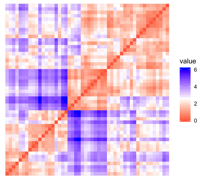
The value of the Hopkins statistic is significantly < 0.5, indicating that the data is highly clusterable. Additionally, It can be seen that the ordered dissimilarity image contains patterns (i.e., clusters).
Estimate the number of clusters in the data
As k-means clustering requires to specify the number of clusters to generate, we’ll use the function clusGap() [cluster package] to compute gap statistics for estimating the optimal number of clusters . The function fviz_gap_stat() [factoextra] is used to visualize the gap statistic plot.
library("cluster")
set.seed(123)
# Compute the gap statistic
gap_stat <- clusGap(df, FUN = kmeans, nstart = 25,
                    K.max = 10, B = 100)
# Plot the result
library(factoextra)
fviz_gap_stat(gap_stat)
The gap statistic suggests a 4 cluster solutions.
It’s also possible to use the function NbClust() [in NbClust] package.
Compute k-means clustering
K-means clustering with k = 4:
# Compute k-means
set.seed(123)
km.res <- kmeans(df, 4, nstart = 25)
head(km.res$cluster, 20)
## Alabama Alaska Arizona Arkansas California Colorado
## 4 3 3 4 3 3
## Connecticut Delaware Florida Georgia Hawaii Idaho
## 2 2 3 4 2 1
## Illinois Indiana Iowa Kansas Kentucky Louisiana
## 3 2 1 2 1 4
## Maine Maryland
## 1 3# Visualize clusters using factoextra
fviz_cluster(km.res, USArrests)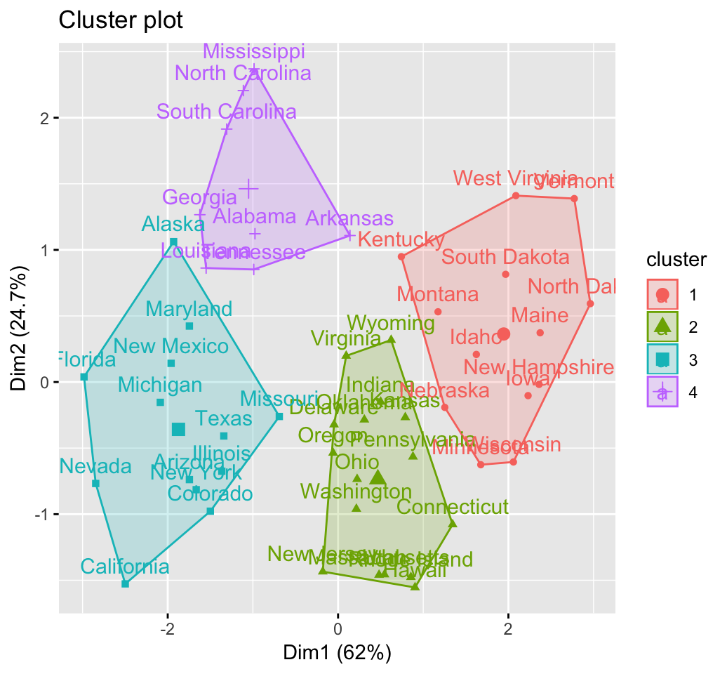
Cluster validation statistics: Inspect cluster silhouette plot
Recall that the silhouette measures (SiSi) how similar an object ii is to the the other objects in its own cluster versus those in the neighbor cluster. SiSi values range from 1 to – 1:
- A value of SiSi close to 1 indicates that the object is well clustered. In the other words, the object ii is similar to the other objects in its group.
- A value of SiSi close to -1 indicates that the object is poorly clustered, and that assignment to some other cluster would probably improve the overall results.
sil <- silhouette(km.res$cluster, dist(df))
rownames(sil) <- rownames(USArrests)
head(sil[, 1:3])
## cluster neighbor sil_width
## Alabama 4 3 0.4858
## Alaska 3 4 0.0583
## Arizona 3 2 0.4155
## Arkansas 4 2 0.1187
## California 3 2 0.4356
## Colorado 3 2 0.3265fviz_silhouette(sil)## cluster size ave.sil.width
## 1 1 13 0.37
## 2 2 16 0.34
## 3 3 13 0.27
## 4 4 8 0.39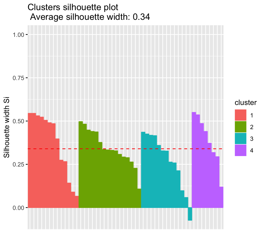
It can be seen that there are some samples which have negative silhouette values. Some natural questions are :
Which samples are these? To what cluster are they closer?
This can be determined from the output of the function silhouette() as follow:
neg_sil_index <- which(sil[, "sil_width"] < 0)
sil[neg_sil_index, , drop = FALSE]
## cluster neighbor sil_width
## Missouri 3 2 -0.0732eclust(): Enhanced clustering analysis
The function eclust() [factoextra package] provides several advantages compared to the standard packages used for clustering analysis:
- It simplifies the workflow of clustering analysis
- It can be used to compute hierarchical clustering and partitioning clustering in a single line function call
- The function eclust() computes automatically the gap statistic for estimating the right number of clusters.
- It automatically provides silhouette information
- It draws beautiful graphs using ggplot2
K-means clustering using eclust()
# Compute k-means
res.km <- eclust(df, "kmeans", nstart = 25)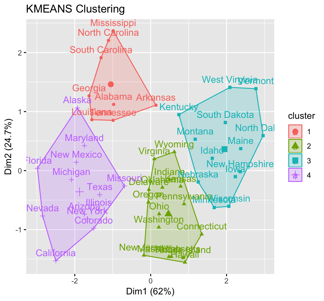
# Gap statistic plot
fviz_gap_stat(res.km$gap_stat)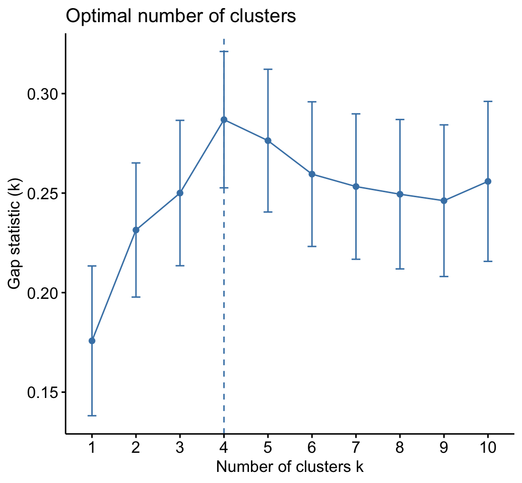
# Silhouette plot
fviz_silhouette(res.km)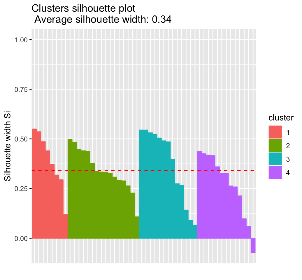
Hierachical clustering using eclust()
# Enhanced hierarchical clustering
res.hc <- eclust(df, "hclust") # compute hclust
## Clustering k = 1,2,..., K.max (= 10): .. done
## Bootstrapping, b = 1,2,..., B (= 100) [one "." per sample]:
## .................................................. 50
## .................................................. 100fviz_dend(res.hc, rect = TRUE) # dendrogam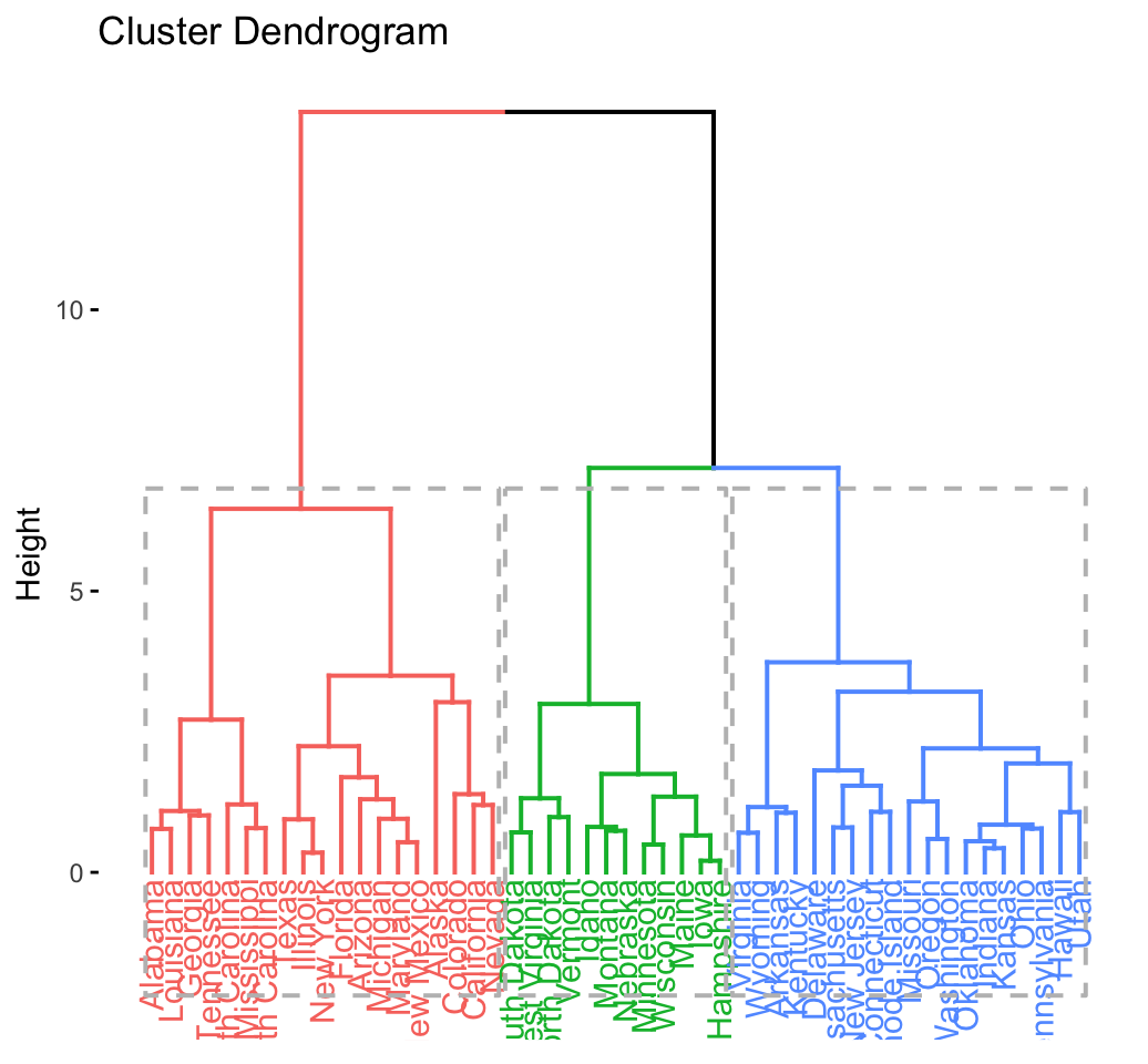
The R code below generates the silhouette plot and the scatter plot for hierarchical clustering.
fviz_silhouette(res.hc) # silhouette plot
fviz_cluster(res.hc) # scatter plot
Python Example for Beginners

Two Machine Learning Fields
There are two sides to machine learning:
- Practical Machine Learning:This is about querying databases, cleaning data, writing scripts to transform data and gluing algorithm and libraries together and writing custom code to squeeze reliable answers from data to satisfy difficult and ill defined questions. It’s the mess of reality.
- Theoretical Machine Learning: This is about math and abstraction and idealized scenarios and limits and beauty and informing what is possible. It is a whole lot neater and cleaner and removed from the mess of reality.
Data Science Resources: Data Science Recipes and Applied Machine Learning Recipes
Introduction to Applied Machine Learning & Data Science for Beginners, Business Analysts, Students, Researchers and Freelancers with Python & R Codes @ Western Australian Center for Applied Machine Learning & Data Science (WACAMLDS) !!!
Latest end-to-end Learn by Coding Recipes in Project-Based Learning:
Applied Statistics with R for Beginners and Business Professionals
Data Science and Machine Learning Projects in Python: Tabular Data Analytics
Data Science and Machine Learning Projects in R: Tabular Data Analytics
Python Machine Learning & Data Science Recipes: Learn by Coding
R Machine Learning & Data Science Recipes: Learn by Coding
Comparing Different Machine Learning Algorithms in Python for Classification (FREE)
Disclaimer: The information and code presented within this recipe/tutorial is only for educational and coaching purposes for beginners and developers. Anyone can practice and apply the recipe/tutorial presented here, but the reader is taking full responsibility for his/her actions. The author (content curator) of this recipe (code / program) has made every effort to ensure the accuracy of the information was correct at time of publication. The author (content curator) does not assume and hereby disclaims any liability to any party for any loss, damage, or disruption caused by errors or omissions, whether such errors or omissions result from accident, negligence, or any other cause. The information presented here could also be found in public knowledge domains.
Google –> SETScholars