Personal Career & Learning Guide for Data Analyst, Data Engineer and Data Scientist
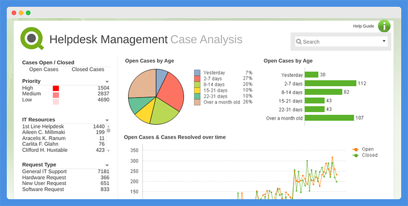
Pie charts are a common type of data visualization tool that is widely used by data analysts to represent data in a graphical format. QlikView is a powerful data analytics software that provides a range of tools for creating pie charts and visualizing data.
In QlikView, creating a pie chart is as simple as selecting the “Pie Chart” option from the “Objects” menu. Once the pie chart object is created, data can be added to it by dragging and dropping fields from the data source into the chart. The software will then automatically generate the pie chart based on the selected data.
One of the benefits of using a pie chart in QlikView is its ability to represent data in a way that is easy to understand and interpret. The pie chart displays data as slices, with each slice representing a portion of the total value. This makes it an ideal tool for presenting data in reports or presentations, as it provides a simple way to visualize the distribution of data across categories or groups.
Another useful feature of QlikView’s pie chart is the ability to display multiple measures in a single chart. This can be especially useful for comparing multiple metrics, such as sales and profits, in a single visualization. This type of chart is known as a stacked pie chart and it allows you to see the contribution of each measure to the total value.
In addition to displaying data, QlikView’s pie chart also provides a range of options for customizing the appearance of the chart. For example, you can change the color and style of the slices, adjust the axis labels and scales, and add a title to the chart. You can also choose to display labels for each slice, making it easy to see the exact values for each category or group.
In conclusion, the pie chart is a valuable tool for data analysts and QlikView provides an easy-to-use and flexible solution for creating pie charts. Whether you are looking to visualize data trends, compare data between groups, or display multiple measures, QlikView’s pie chart is an excellent tool for bringing your data to life.
QlikView for Data Analyst – QlikView – Pie Chart
 Loading...
Latest end-to-end Learn by Coding Projects (Jupyter Notebooks) in Python and R:
All Notebooks in One Bundle: Data Science Recipes and Examples in Python & R.
End-to-End Python Machine Learning Recipes & Examples.
End-to-End R Machine Learning Recipes & Examples.
Applied Statistics with R for Beginners and Business Professionals
Data Science and Machine Learning Projects in Python: Tabular Data Analytics
Data Science and Machine Learning Projects in R: Tabular Data Analytics
Python Machine Learning & Data Science Recipes: Learn by Coding
R Machine Learning & Data Science Recipes: Learn by Coding
Comparing Different Machine Learning Algorithms in Python for Classification (FREE)
There are 2000+ End-to-End Python & R Notebooks are available to build Professional Portfolio as a Data Scientist and/or Machine Learning Specialist. All Notebooks are only $29.95. We would like to request you to have a look at the website for FREE the end-to-end notebooks, and then decide whether you would like to purchase or not.