GGANIMATE: HOW TO CREATE PLOTS WITH BEAUTIFUL ANIMATION IN R
This article describes how to create animation in R using the gganimate R package.
gganimate is an extension of the ggplot2 package for creating animated ggplots. It provides a range of new functionality that can be added to the plot object in order to customize how it should change with time.
Key features of gganimate:
- transitions: you want your data to change
- views: you want your viewpoint to change
- shadows: you want the animation to have memory
Contents:
- Prerequisites
- Demo dataset
- Static plot
- Transition through distinct states in time
- Basics
- Let the view follow the data in each frame
- Show preceding frames with gradual falloff
- Show the original data as background marks
- Reveal data along a given dimension
- Static plot
- Let data gradually appear
- Transition between several distinct stages of the data
- Save animation
Prerequisites
gganimate stable version is available on CRAN and can be installed with install.packages('gganimate'). The latest development version can be installed as follow: devtools::install_github('thomasp85/gganimate').
Note that, in this tutorial, we used the latest developmental version.
Load required packages and set the default ggplot2 theme to theme_bw():
library(ggplot2)
library(gganimate)
theme_set(theme_bw())
Demo dataset
library(gapminder)
head(gapminder)
## # A tibble: 6 x 6
## country continent year lifeExp pop gdpPercap
## <fct> <fct> <int> <dbl> <int> <dbl>
## 1 Afghanistan Asia 1952 28.8 8425333 779.
## 2 Afghanistan Asia 1957 30.3 9240934 821.
## 3 Afghanistan Asia 1962 32.0 10267083 853.
## 4 Afghanistan Asia 1967 34.0 11537966 836.
## 5 Afghanistan Asia 1972 36.1 13079460 740.
## 6 Afghanistan Asia 1977 38.4 14880372 786.Static plot
p <- ggplot(
  gapminder,
  aes(x = gdpPercap, y=lifeExp, size = pop, colour = country)
  ) +
  geom_point(show.legend = FALSE, alpha = 0.7) +
  scale_color_viridis_d() +
  scale_size(range = c(2, 12)) +
  scale_x_log10() +
  labs(x = "GDP per capita", y = "Life expectancy")
p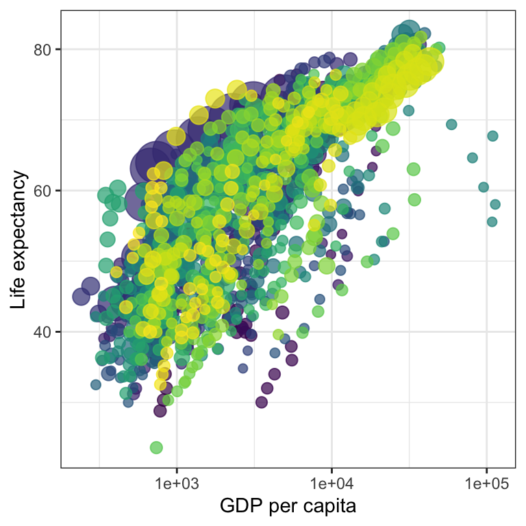
Transition through distinct states in time
Basics
Key R function: transition_time(). The transition length between the states will be set to correspond to the actual time difference between them.
Label variables: frame_time. Gives the time that the current frame corresponds to.
p + transition_time(year) +
  labs(title = "Year: {frame_time}")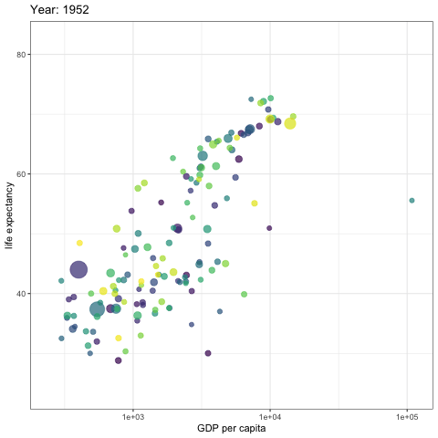
Create facets by continent:
p + facet_wrap(~continent) +
  transition_time(year) +
  labs(title = "Year: {frame_time}")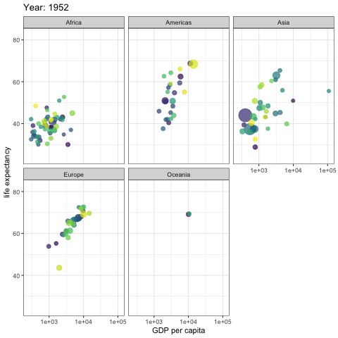
Let the view follow the data in each frame
p + transition_time(year) +
  labs(title = "Year: {frame_time}") +
  view_follow(fixed_y = TRUE)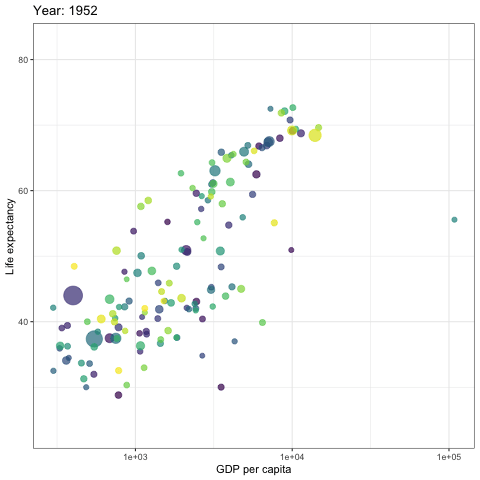
Show preceding frames with gradual falloff
This shadow is meant to draw a small wake after data by showing the latest frames up to the current. You can choose to gradually diminish the size and/or opacity of the shadow. The length of the wake is not given in absolute frames as that would make the animation susceptible to changes in the framerate. Instead it is given as a proportion of the total length of the animation.
p + transition_time(year) +
  labs(title = "Year: {frame_time}") +
  shadow_wake(wake_length = 0.1, alpha = FALSE)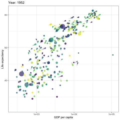
Show the original data as background marks
This shadow lets you show the raw data behind the current frame. Both past and/or future raw data can be shown and styled as you want.
p + transition_time(year) +
  labs(title = "Year: {frame_time}") +
  shadow_mark(alpha = 0.3, size = 0.5)
Reveal data along a given dimension
This transition allows you to let data gradually appear, based on a given time dimension.
Static plot
p <- ggplot(
  airquality,
  aes(Day, Temp, group = Month, color = factor(Month))
  ) +
  geom_line() +
  scale_color_viridis_d() +
  labs(x = "Day of Month", y = "Temperature") +
  theme(legend.position = "top")
p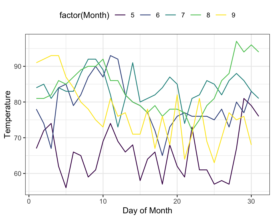
Let data gradually appear
- Reveal by day (x-axis)
p + transition_reveal(Day)
- Show points:
p +
  geom_point() +
  transition_reveal(Day)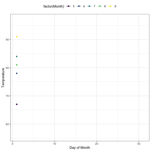
- Points can be kept by giving them a unique group:
p +
  geom_point(aes(group = seq_along(Day))) +
  transition_reveal(Day)
Transition between several distinct stages of the data
Data preparation:
library(dplyr)
mean.temp <- airquality %>%
  group_by(Month) %>%
  summarise(Temp = mean(Temp))
mean.temp
## # A tibble: 5 x 2
## Month Temp
## <int> <dbl>
## 1 5 65.5
## 2 6 79.1
## 3 7 83.9
## 4 8 84.0
## 5 9 76.9Create a bar plot of mean temperature:
p <- ggplot(mean.temp, aes(Month, Temp, fill = Temp)) +
  geom_col() +
  scale_fill_distiller(palette = "Reds", direction = 1) +
  theme_minimal() +
  theme(
    panel.grid = element_blank(),
    panel.grid.major.y = element_line(color = "white"),
    panel.ontop = TRUE
  )
p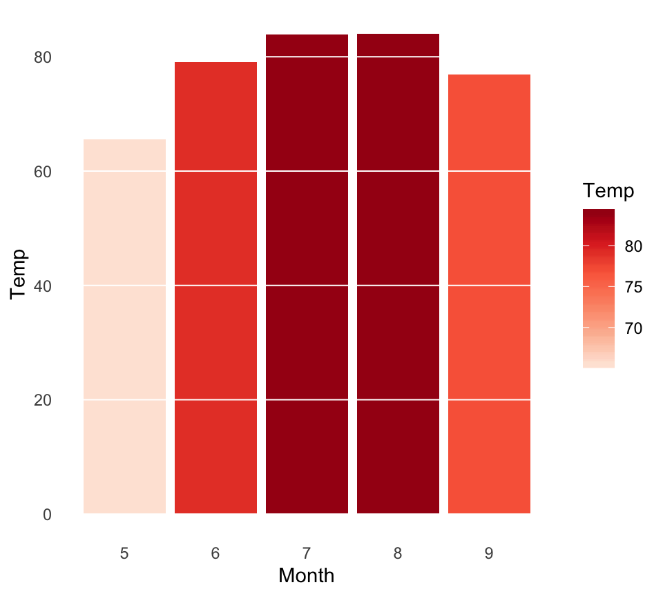
- transition_states():
p + transition_states(Month, wrap = FALSE) +
  shadow_mark()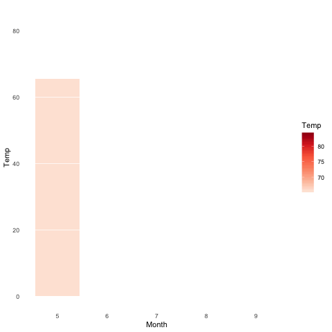
- enter_grow() + enter_fade()
p + transition_states(Month, wrap = FALSE) +
  shadow_mark() +
  enter_grow() +
  enter_fade()
Save animation
If you need to save the animation for later use you can use the anim_save() function.
It works much like ggsave() from ggplot2 and automatically grabs the last rendered animation if you do not specify one directly.
Example of usage:
Read more
Python Example for Beginners
Two Machine Learning Fields
There are two sides to machine learning:
- Practical Machine Learning:This is about querying databases, cleaning data, writing scripts to transform data and gluing algorithm and libraries together and writing custom code to squeeze reliable answers from data to satisfy difficult and ill defined questions. It’s the mess of reality.
- Theoretical Machine Learning: This is about math and abstraction and idealized scenarios and limits and beauty and informing what is possible. It is a whole lot neater and cleaner and removed from the mess of reality.
Data Science Resources: Data Science Recipes and Applied Machine Learning Recipes
Introduction to Applied Machine Learning & Data Science for Beginners, Business Analysts, Students, Researchers and Freelancers with Python & R Codes @ Western Australian Center for Applied Machine Learning & Data Science (WACAMLDS) !!!
Latest end-to-end Learn by Coding Recipes in Project-Based Learning:
Applied Statistics with R for Beginners and Business Professionals
Data Science and Machine Learning Projects in Python: Tabular Data Analytics
Data Science and Machine Learning Projects in R: Tabular Data Analytics
Python Machine Learning & Data Science Recipes: Learn by Coding
R Machine Learning & Data Science Recipes: Learn by Coding
Comparing Different Machine Learning Algorithms in Python for Classification (FREE)
Disclaimer: The information and code presented within this recipe/tutorial is only for educational and coaching purposes for beginners and developers. Anyone can practice and apply the recipe/tutorial presented here, but the reader is taking full responsibility for his/her actions. The author (content curator) of this recipe (code / program) has made every effort to ensure the accuracy of the information was correct at time of publication. The author (content curator) does not assume and hereby disclaims any liability to any party for any loss, damage, or disruption caused by errors or omissions, whether such errors or omissions result from accident, negligence, or any other cause. The information presented here could also be found in public knowledge domains.