Waterfall Plot in Python
Waterfall chart is a 2D plot that is used to understand the effects of adding positive or negative values over time or over multiple steps or a variable. Waterfall chart is frequently used in financial analysis to understand the gain and loss contributions of multiple factors over a particular asset.
Contents
- Introduction
- Simple Waterfall Plot
- Varying parameters in Waterfall Plot
- Analyzing a waterfall plot
- Interpreting feature importance
Introduction
Waterfall chart is a 2-dimensional plot that is used to understanding the cumulative effects of sequentially added positive or negative values for a given variable.
This will help you in knowing about how an initial value is increased and decreased over time or over a series of intermediate steps.
The cumulative effects can be either time based or category based.
This type of plot is commonly used in financial analysis to understand how a particular value goes through gains and losses over time.
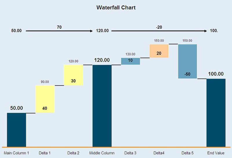
Notice that only some of the columns (generally initial and final column) are shown fully and the other columns in between are shown as floating columns( they only show the increase or decrease in the value).
We will look into how to draw a waterfall chart like the one shown above.
First, you need to install the waterfallcharts library to use the waterfall_chart.
/* Install */
!pip install waterfallcharts
Then I am going to import all the required libraries that I will be using in this article.
import pandas as pd
import numpy as np
import waterfall_chart
import matplotlib.pyplot as plt
%matplotlib inline
plt.rcParams.update({'figure.figsize':(7.5,5), 'figure.dpi':100})
Now, let’s look at how to plot a simple waterfall chart in Python.
Simple Waterfall Plot
Use the plot() function in waterfall_chart library to generate a waterfall chart. Values of x and y-axis should be passed as parameters into the function. Let’s try to visualize a simple cash flow chart for whole year months.
/* plotting a simple waterfall chart */
import waterfall_chart
import matplotlib.pyplot as plt
a = ['jan','feb','mar','apr','may','jun','jul','aug','sep','oct','nov','dec']
b = [1000,-300,400,-100,100,-700,400,-300,500,-700,100,50]
waterfall_chart.plot(a, b);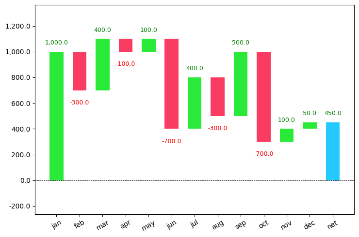
You can see that it took the initial value and started adding and subtracting the values that I have passed and also calculated the final left out amount.
The increasing values are shown in green color and the decreasing values are shown in red color.
This plot is used extensively in the finance sector for checking their revenues.
Varying parameters in Waterfall plot
Set sorted_value=True inside the plot() function to sort the values based on the absolute value of every month.
/* varying the sorted_value parameter */
import waterfall_chart
import matplotlib.pyplot as plt
a = ['jan','feb','mar','apr','may','jun','jul','aug','sep','oct','nov','dec']
b = [1000,-300,400,-100,100,-700,400,-300,500,-700,100,50]
waterfall_chart.plot(a, b,sorted_value=True)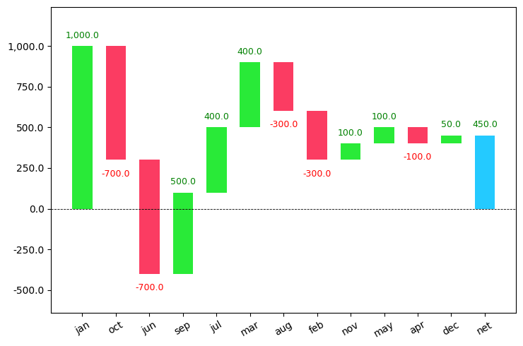
As you can see the values are sorted based on their absolute values in descending order.
Use the net_label="" command to change the final column name which is set to default as net.
rotation_value=90 can be used to rotate the x-axis names in vertical mode.
/* varying the net_label parameter */
import waterfall_chart
import matplotlib.pyplot as plt
a = ['jan','feb','mar','apr','may','jun','jul','aug','sep','oct','nov','dec']
b = [1000,-300,400,-100,100,-700,400,-300,500,-700,100,50]
waterfall_chart.plot(a, b,sorted_value=True,net_label='LeftOver',rotation_value=90)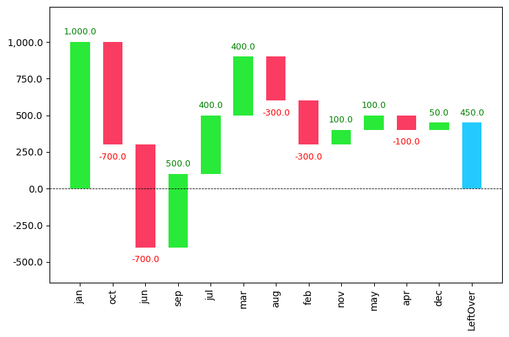
There is also another command threshold which groups all contributions under a certain threshold to as a separate ‘other’ contribution.
If you set the value of the threshold to be 0.5, then it will take only the first half of the dataset and show it in the graph. The other part will be shown in the other column.
/* using the threshold parameter */
import waterfall_chart
import matplotlib.pyplot as plt
a = ['jan','feb','mar','apr','may','jun','jul','aug','sep','oct','nov','dec']
b = [1000,-300,400,-100,100,-700,400,-300,500,-700,100,50]
waterfall_chart.plot(a, b,sorted_value=True,net_label='LeftOver',rotation_value=90,threshold=0.5)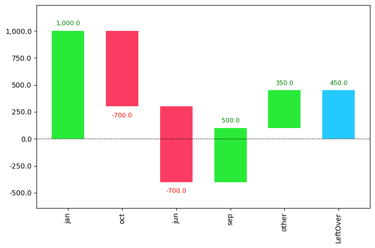
Analyzing a waterfall chart
A waterfall chart can be used for analytical purposes, especially for understanding the transition in the quantitative value of an entity that is subjected to increment or decrement.
Let’s look at a waterfall chart containing yearly data with revenue from each quarter and try to get some insights.
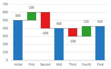
The first column initial contains the value at the start of the year. Then for each quarter, you can see whether the amount has increased or not. During the midway of the year, you can see that the value has decreased to 400.
Then during the next half, the value decreased in the 3rd quarter and increased in the 4th quarter leading to a total value of 425.
Waterfall charts represent increasing values in green color and decreasing values in red color.
Waterfall charts can also be used in various cases like inventory and performance analysis.
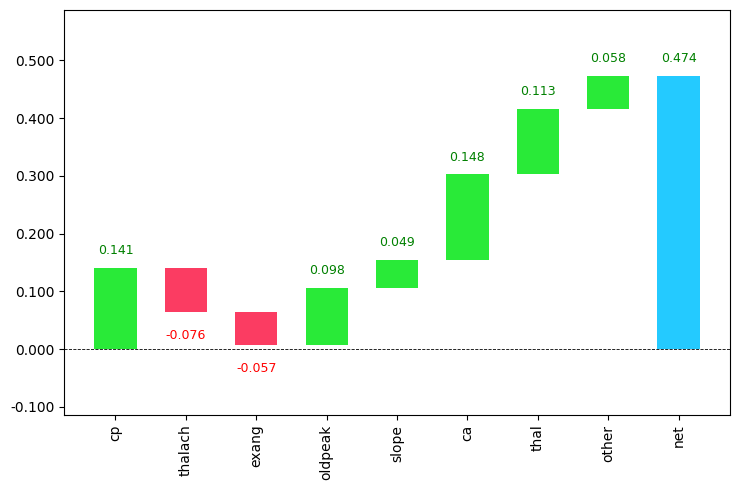
Waterfall Chart for Interpreting Feature Importance
I am going to be using the heart dataset from kaggle in which the main goal is to predict whether the person has got heart disease or not using the given features. I will be using RandomForestClassifier for modeling. Then the waterfall chart is used to visualize the importance of each variable.
Download the dataset from the given link :
https://www.kaggle.com/ronitf/heart-disease-uci/download
Now, let’s look at the code.
/* importing the required files and libarries */
import numpy as np
import pandas as pd
from sklearn.model_selection import train_test_split
df=pd.read_csv("heart.csv")
df.head()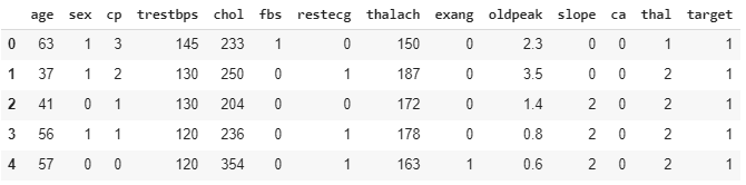
/* Build Random forest model */
/* 1. splitting the dataset into test and train */
y=df['target']
df.drop('target',axis=1,inplace=True)
X_train,X_test,y_train,y_test=train_test_split(df,y)

/* 2. creating the model */
from sklearn.ensemble import RandomForestRegressor, RandomForestClassifier
model = RandomForestClassifier(n_estimators = 150,
                               random_state = 101)

/* 3. fitting the model */
model.fit(X_train,y_train)RandomForestClassifier(bootstrap=True, ccp_alpha=0.0, class_weight=None,
criterion='gini', max_depth=None, max_features='auto',
max_leaf_nodes=None, max_samples=None,
min_impurity_decrease=0.0, min_impurity_split=None,
min_samples_leaf=1, min_samples_split=2,
min_weight_fraction_leaf=0.0, n_estimators=150,
n_jobs=None, oob_score=False, random_state=101,
verbose=0, warm_start=False)
Let’s use treeinterpreter to interpret the importance of variables. So you need to install the library first.
!pip install treeinterpreter /* for installing the first time */

from treeinterpreter import treeinterpreter as ti
rownames = X_test.values[None,1]
prediction, bias, contributions = ti.predict(model, rownames)
contributions = [contributions[0][i][0] for i in range(len(contributions[0]))]
colnames = X_test.columns[0:].values
From the above output, you can use the column names and contributions to draw the waterfall_chart.
/* waterfall chart */
import waterfall_chart
my_plot=waterfall_chart.plot(colnames, contributions, rotation_value=90, threshold=0.3,formatting='{:,.3f}')
Python Example for Beginners

Two Machine Learning Fields
There are two sides to machine learning:
- Practical Machine Learning:This is about querying databases, cleaning data, writing scripts to transform data and gluing algorithm and libraries together and writing custom code to squeeze reliable answers from data to satisfy difficult and ill defined questions. It’s the mess of reality.
- Theoretical Machine Learning: This is about math and abstraction and idealized scenarios and limits and beauty and informing what is possible. It is a whole lot neater and cleaner and removed from the mess of reality.
Data Science Resources: Data Science Recipes and Applied Machine Learning Recipes
Introduction to Applied Machine Learning & Data Science for Beginners, Business Analysts, Students, Researchers and Freelancers with Python & R Codes @ Western Australian Center for Applied Machine Learning & Data Science (WACAMLDS) !!!
Latest end-to-end Learn by Coding Recipes in Project-Based Learning:
Applied Statistics with R for Beginners and Business Professionals
Data Science and Machine Learning Projects in Python: Tabular Data Analytics
Data Science and Machine Learning Projects in R: Tabular Data Analytics
Python Machine Learning & Data Science Recipes: Learn by Coding
R Machine Learning & Data Science Recipes: Learn by Coding
Comparing Different Machine Learning Algorithms in Python for Classification (FREE)
Disclaimer: The information and code presented within this recipe/tutorial is only for educational and coaching purposes for beginners and developers. Anyone can practice and apply the recipe/tutorial presented here, but the reader is taking full responsibility for his/her actions. The author (content curator) of this recipe (code / program) has made every effort to ensure the accuracy of the information was correct at time of publication. The author (content curator) does not assume and hereby disclaims any liability to any party for any loss, damage, or disruption caused by errors or omissions, whether such errors or omissions result from accident, negligence, or any other cause. The information presented here could also be found in public knowledge domains.