
(Basic Statistics for Citizen Data Scientist)
ROC Curve
The ROC Curve is a plot of values of the False Positive Rate (FPR) versus the True Positive Rate (TPR) for a specified cutoff value.
Example 1: Create the ROC curve for Example 1 of Classification Table.
We begin by creating the ROC table as shown on the left side of Figure 1 from the input data in range A5:C17.
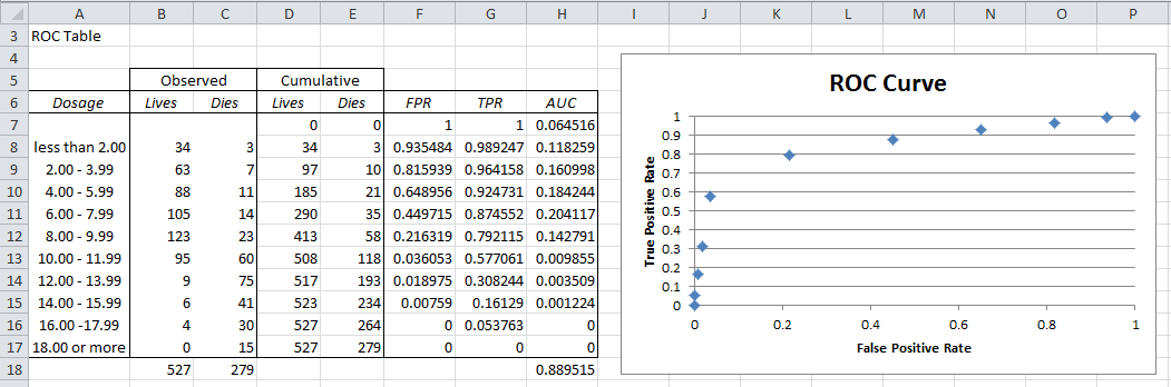
Figure 1 – ROC Table and Curve
First we create the cumulative values for Failure and Success (columns D and E) and then the values of FPR and TPR for each row (columns F and G). E.g. the entries for row 9 are calculated via the following formulas:
| Cell | Meaning | Formula |
| D9 | Failure Cumulative | =D8+B9 |
| E9 | Success Cumulative | =E8+C9 |
| F9 | FPR | =1-D9/D$17 |
| G9 | TPR | =1-E9/E$17 |
| H9 | AUC | =(F9-F10)*G9 |
Figure 2 – Selected formulas from Figure 1
The ROC curve can then be created by highlighting the range F7:G17 and selecting Insert > Charts|Scatter and adding the chart and axes titles (as described in Excel Charts). The result is shown on the right side of Figure 1. The actual ROC curve is a step function with the points shown in the figure.
Observation: The higher the ROC curve (i.e. the closer to the line y = 1) the better the fit. In fact the area under the curve (AUC) can be used for this purpose. The closer AUC is to 1 (the maximum value) the better the fit. Values close to .5 show that the model’s ability to discriminate between success and failure is due to chance.
For Example 1, the AUC is simply the sum of the areas of each of the rectangles in the step function. The formula for calculating the area for the rectangle corresponding to row 9 (i.e. the formula in cell H9) is shown in Figure 2. The formula for calculating the AUC (cell H18) is =SUM(H7:H17). The calculated value of .889515 shows a pretty good fit.
Statistics for Beginners in Excel – ROC Curve
Disclaimer: The information and code presented within this recipe/tutorial is only for educational and coaching purposes for beginners and developers. Anyone can practice and apply the recipe/tutorial presented here, but the reader is taking full responsibility for his/her actions. The author (content curator) of this recipe (code / program) has made every effort to ensure the accuracy of the information was correct at time of publication. The author (content curator) does not assume and hereby disclaims any liability to any party for any loss, damage, or disruption caused by errors or omissions, whether such errors or omissions result from accident, negligence, or any other cause. The information presented here could also be found in public knowledge domains.
Learn by Coding: v-Tutorials on Applied Machine Learning and Data Science for Beginners
Latest end-to-end Learn by Coding Projects (Jupyter Notebooks) in Python and R:
All Notebooks in One Bundle: Data Science Recipes and Examples in Python & R.
End-to-End Python Machine Learning Recipes & Examples.
End-to-End R Machine Learning Recipes & Examples.
Applied Statistics with R for Beginners and Business Professionals
Data Science and Machine Learning Projects in Python: Tabular Data Analytics
Data Science and Machine Learning Projects in R: Tabular Data Analytics
Python Machine Learning & Data Science Recipes: Learn by Coding
R Machine Learning & Data Science Recipes: Learn by Coding
Comparing Different Machine Learning Algorithms in Python for Classification (FREE)
There are 2000+ End-to-End Python & R Notebooks are available to build Professional Portfolio as a Data Scientist and/or Machine Learning Specialist. All Notebooks are only $29.95. We would like to request you to have a look at the website for FREE the end-to-end notebooks, and then decide whether you would like to purchase or not.