
(R Tutorials for Citizen Data Scientist)
R Visualisation for Beginners – Pie Charts
R Programming language has numerous libraries to create charts and graphs. A pie-chart is a representation of values as slices of a circle with different colors. The slices are labeled and the numbers corresponding to each slice is also represented in the chart.
In R the pie chart is created using the pie() function which takes positive numbers as a vector input. The additional parameters are used to control labels, color, title etc.
Syntax
The basic syntax for creating a pie-chart using the R is −
pie(x, labels, radius, main, col, clockwise)
Following is the description of the parameters used −
- x is a vector containing the numeric values used in the pie chart.
- labels is used to give description to the slices.
- radius indicates the radius of the circle of the pie chart.(value between −1 and +1).
- main indicates the title of the chart.
- col indicates the color palette.
- clockwise is a logical value indicating if the slices are drawn clockwise or anti clockwise.
Example
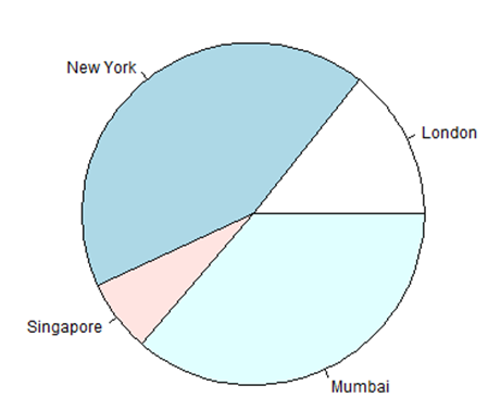
A very simple pie-chart is created using just the input vector and labels. The below script will create and save the pie chart in the current R working directory.
# Create data for the graph.
x <- c(21, 62, 10, 53)
labels <- c("London", "New York", "Singapore", "Mumbai")

# Give the chart file a name.
png(file = "city.png")

# Plot the chart.
pie(x,labels)

# Save the file.
dev.off()
When we execute the above code, it produces the following result −
Pie Chart Title and Colors
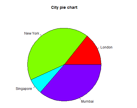
We can expand the features of the chart by adding more parameters to the function. We will use parameter main to add a title to the chart and another parameter is col which will make use of rainbow colour pallet while drawing the chart. The length of the pallet should be same as the number of values we have for the chart. Hence we use length(x).
Example
The below script will create and save the pie chart in the current R working directory.
# Create data for the graph.
x <- c(21, 62, 10, 53)
labels <- c("London", "New York", "Singapore", "Mumbai")

# Give the chart file a name.
png(file = "city_title_colours.jpg")

# Plot the chart with title and rainbow color pallet.
pie(x, labels, main = "City pie chart", col = rainbow(length(x)))

# Save the file.
dev.off()
When we execute the above code, it produces the following result −
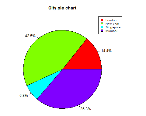
Slice Percentages and Chart Legend
We can add slice percentage and a chart legend by creating additional chart variables.
# Create data for the graph.
x <-  c(21, 62, 10,53)
labels <-  c("London","New York","Singapore","Mumbai")

piepercent<- round(100*x/sum(x), 1)

# Give the chart file a name.
png(file = "city_percentage_legends.jpg")

# Plot the chart.
pie(x, labels = piepercent, main = "City pie chart",col = rainbow(length(x)))
legend("topright", c("London","New York","Singapore","Mumbai"), cex = 0.8,
   fill = rainbow(length(x)))

# Save the file.
dev.off()
When we execute the above code, it produces the following result −
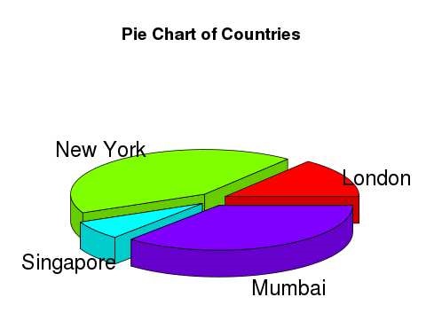
3D Pie Chart
A pie chart with 3 dimensions can be drawn using additional packages. The package plotrix has a function called pie3D() that is used for this.
# Get the library.
library(plotrix)

# Create data for the graph.
x <-  c(21, 62, 10,53)
lbl <-  c("London","New York","Singapore","Mumbai")

# Give the chart file a name.
png(file = "3d_pie_chart.jpg")

# Plot the chart.
pie3D(x,labels = lbl,explode = 0.1, main = "Pie Chart of Countries ")

# Save the file.
dev.off()
When we execute the above code, it produces the following result −
Python Data Visualisation for Business Analyst – How to do Pie Plot in Python
R Visualisation for Beginners – Pie Charts
Disclaimer: The information and code presented within this recipe/tutorial is only for educational and coaching purposes for beginners and developers. Anyone can practice and apply the recipe/tutorial presented here, but the reader is taking full responsibility for his/her actions. The author (content curator) of this recipe (code / program) has made every effort to ensure the accuracy of the information was correct at time of publication. The author (content curator) does not assume and hereby disclaims any liability to any party for any loss, damage, or disruption caused by errors or omissions, whether such errors or omissions result from accident, negligence, or any other cause. The information presented here could also be found in public knowledge domains.
Learn by Coding: v-Tutorials on Applied Machine Learning and Data Science for Beginners
Latest end-to-end Learn by Coding Projects (Jupyter Notebooks) in Python and R:
All Notebooks in One Bundle: Data Science Recipes and Examples in Python & R.
End-to-End Python Machine Learning Recipes & Examples.
End-to-End R Machine Learning Recipes & Examples.
Applied Statistics with R for Beginners and Business Professionals
Data Science and Machine Learning Projects in Python: Tabular Data Analytics
Data Science and Machine Learning Projects in R: Tabular Data Analytics
Python Machine Learning & Data Science Recipes: Learn by Coding
R Machine Learning & Data Science Recipes: Learn by Coding
Comparing Different Machine Learning Algorithms in Python for Classification (FREE)
There are 2000+ End-to-End Python & R Notebooks are available to build Professional Portfolio as a Data Scientist and/or Machine Learning Specialist. All Notebooks are only $29.95. We would like to request you to have a look at the website for FREE the end-to-end notebooks, and then decide whether you would like to purchase or not.