
(R Tutorials for Citizen Data Scientist)
R Visualisation for Beginners – Histograms
A histogram represents the frequencies of values of a variable bucketed into ranges. Histogram is similar to bar chat but the difference is it groups the values into continuous ranges. Each bar in histogram represents the height of the number of values present in that range.
R creates histogram using hist() function. This function takes a vector as an input and uses some more parameters to plot histograms.
Syntax
The basic syntax for creating a histogram using R is −
hist(v,main,xlab,xlim,ylim,breaks,col,border)
Following is the description of the parameters used −
- v is a vector containing numeric values used in histogram.
- main indicates title of the chart.
- col is used to set color of the bars.
- border is used to set border color of each bar.
- xlab is used to give description of x-axis.
- xlim is used to specify the range of values on the x-axis.
- ylim is used to specify the range of values on the y-axis.
- breaks is used to mention the width of each bar.
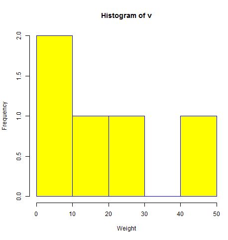
Example
A simple histogram is created using input vector, label, col and border parameters.
The script given below will create and save the histogram in the current R working directory.
# Create data for the graph.
v <-  c(9,13,21,8,36,22,12,41,31,33,19)

# Give the chart file a name.
png(file = "histogram.png")

# Create the histogram.
hist(v,xlab = "Weight",col = "yellow",border = "blue")

# Save the file.
dev.off()
When we execute the above code, it produces the following result −
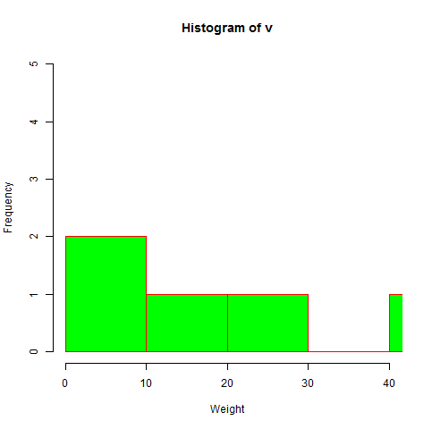
Range of X and Y values
To specify the range of values allowed in X axis and Y axis, we can use the xlim and ylim parameters.
The width of each of the bar can be decided by using breaks.
# Create data for the graph.
v <- c(9,13,21,8,36,22,12,41,31,33,19)

# Give the chart file a name.
png(file = "histogram_lim_breaks.png")

# Create the histogram.
hist(v,xlab = "Weight",col = "green",border = "red", xlim = c(0,40), ylim = c(0,5),
   breaks = 5)

# Save the file.
dev.off()
When we execute the above code, it produces the following result −
R Visualisation for Beginners – Histograms
Disclaimer: The information and code presented within this recipe/tutorial is only for educational and coaching purposes for beginners and developers. Anyone can practice and apply the recipe/tutorial presented here, but the reader is taking full responsibility for his/her actions. The author (content curator) of this recipe (code / program) has made every effort to ensure the accuracy of the information was correct at time of publication. The author (content curator) does not assume and hereby disclaims any liability to any party for any loss, damage, or disruption caused by errors or omissions, whether such errors or omissions result from accident, negligence, or any other cause. The information presented here could also be found in public knowledge domains.
Learn by Coding: v-Tutorials on Applied Machine Learning and Data Science for Beginners
Latest end-to-end Learn by Coding Projects (Jupyter Notebooks) in Python and R:
All Notebooks in One Bundle: Data Science Recipes and Examples in Python & R.
End-to-End Python Machine Learning Recipes & Examples.
End-to-End R Machine Learning Recipes & Examples.
Applied Statistics with R for Beginners and Business Professionals
Data Science and Machine Learning Projects in Python: Tabular Data Analytics
Data Science and Machine Learning Projects in R: Tabular Data Analytics
Python Machine Learning & Data Science Recipes: Learn by Coding
R Machine Learning & Data Science Recipes: Learn by Coding
Comparing Different Machine Learning Algorithms in Python for Classification (FREE)
There are 2000+ End-to-End Python & R Notebooks are available to build Professional Portfolio as a Data Scientist and/or Machine Learning Specialist. All Notebooks are only $29.95. We would like to request you to have a look at the website for FREE the end-to-end notebooks, and then decide whether you would like to purchase or not.