(Python Data Visualisation Tutorials)
Python Data Visualisation for Business Analyst – How to do Autocorrelation (ACF) and Partial Autocorrelation (PACF) Plot in Python
In this data visualisation tutorial, How to do Autocorrelation (ACF) and Partial Autocorrelation (PACF) Plot in Python.
The ACF plot shows the correlation of the time series with its own lags. Each vertical line (on the autocorrelation plot) represents the correlation between the series and its lag starting from lag 0. The blue shaded region in the plot is the significance level. Those lags that lie above the blue line are the significant lags.
So how to interpret this?
For AirPassengers, we see upto 14 lags have crossed the blue line and so are significant. This means, the Air Passengers traffic seen up to 14 years back has an influence on the traffic seen today.
PACF on the other had shows the autocorrelation of any given lag (of time series) against the current series, but with the contributions of the lags-in-between removed.
Setup
Run this once before the plot’s code. The individual charts, however, may redefine its own aesthetics.
/* !pip install brewer2mpl */
import numpy as np
import pandas as pd
import matplotlib as mpl
import matplotlib.pyplot as plt
import seaborn as sns
import warnings; warnings.filterwarnings(action='once')

large = 22; med = 16; small = 12
params = {'axes.titlesize': large,
          'legend.fontsize': med,
          'figure.figsize': (16, 10),
          'axes.labelsize': med,
          'axes.titlesize': med,
          'xtick.labelsize': med,
          'ytick.labelsize': med,
          'figure.titlesize': large}
plt.rcParams.update(params)
plt.style.use('seaborn-whitegrid')
sns.set_style("white")
%matplotlib inline

/* Version */
print(mpl.__version__)
print(sns.__version__)How to do Autocorrelation (ACF) and Partial Autocorrelation (PACF) Plot in Python
Download Code:
from statsmodels.graphics.tsaplots import plot_acf, plot_pacf

/* Import Data */
df = pd.read_csv('AirPassengers.csv')

/* Draw Plot */
fig, (ax1, ax2) = plt.subplots(1, 2,figsize=(16,6), dpi= 80)
plot_acf(df.traffic.tolist(), ax=ax1, lags=50)
plot_pacf(df.traffic.tolist(), ax=ax2, lags=20)

/* Decorate */
/* lighten the borders */
ax1.spines["top"].set_alpha(.3); ax2.spines["top"].set_alpha(.3)
ax1.spines["bottom"].set_alpha(.3); ax2.spines["bottom"].set_alpha(.3)
ax1.spines["right"].set_alpha(.3); ax2.spines["right"].set_alpha(.3)
ax1.spines["left"].set_alpha(.3); ax2.spines["left"].set_alpha(.3)

/* font size of tick labels */
ax1.tick_params(axis='both', labelsize=12)
ax2.tick_params(axis='both', labelsize=12)
plt.show()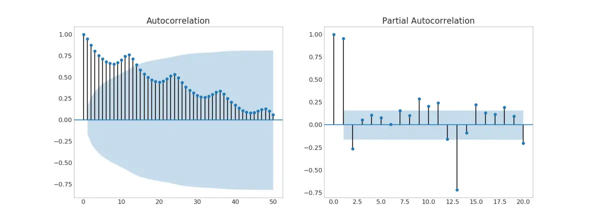
Disclaimer: The information and code presented within this recipe/tutorial is only for educational and coaching purposes for beginners and developers. Anyone can practice and apply the recipe/tutorial presented here, but the reader is taking full responsibility for his/her actions. The author (content curator) of this recipe (code / program) has made every effort to ensure the accuracy of the information was correct at time of publication. The author (content curator) does not assume and hereby disclaims any liability to any party for any loss, damage, or disruption caused by errors or omissions, whether such errors or omissions result from accident, negligence, or any other cause. The information presented here could also be found in public knowledge domains.
Learn by Coding: v-Tutorials on Applied Machine Learning and Data Science for Beginners
Latest end-to-end Learn by Coding Projects (Jupyter Notebooks) in Python and R:
All Notebooks in One Bundle: Data Science Recipes and Examples in Python & R.
End-to-End Python Machine Learning Recipes & Examples.
End-to-End R Machine Learning Recipes & Examples.
Applied Statistics with R for Beginners and Business Professionals
Data Science and Machine Learning Projects in Python: Tabular Data Analytics
Data Science and Machine Learning Projects in R: Tabular Data Analytics
Python Machine Learning & Data Science Recipes: Learn by Coding
R Machine Learning & Data Science Recipes: Learn by Coding
Comparing Different Machine Learning Algorithms in Python for Classification (FREE)
There are 2000+ End-to-End Python & R Notebooks are available to build Professional Portfolio as a Data Scientist and/or Machine Learning Specialist. All Notebooks are only $29.95. We would like to request you to have a look at the website for FREE the end-to-end notebooks, and then decide whether you would like to purchase or not.
Machine Learning for Beginners in Python: How to Use Lag A Time Feature
Python Data Visualisation for Business Analyst – How to plot Diverging Dot in Python