Personal Career & Learning Guide for Data Analyst, Data Engineer and Data Scientist
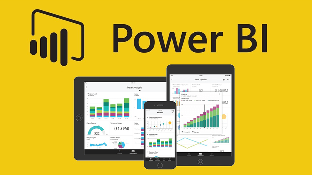
Power BI is a powerful business intelligence tool that helps organizations to visualize and analyze data in an interactive and meaningful way. One of the key features of Power BI is its wide range of visualization options, which allows users to present their data in a variety of formats. In this article, we’ll provide a layman’s overview of the various visualization options available in Power BI.
- Charts
Charts are one of the most commonly used visualization options in Power BI. They allow users to present their data in a visual format that is easy to understand. Power BI supports a wide range of chart types, including bar charts, line charts, pie charts, and more. Charts are great for comparing data and identifying trends.
- Maps
Maps are a great way to visualize data that is geographically based. With Power BI, users can create maps that show the distribution of data across a geographic region. Maps can be customized to show a range of data, such as sales data by region, or customer data by city.
- Tables
Tables are a simple and effective way to present data in a tabular format. Tables are great for presenting data in a structured and organized manner, and can be customized to display specific data fields. With Power BI, users can create tables that are easy to understand and navigate.
- Cards
Cards are a simple way to display a single data point or metric. Cards can be used to display data such as total sales, number of customers, or any other data that is important to your organization. With Power BI, users can create cards that are easy to understand and provide quick insights into the data.
- KPIs
Key Performance Indicators (KPIs) are a way to measure and monitor the performance of an organization. With Power BI, users can create KPIs that help them to track their progress and measure their success. KPIs can be customized to show data such as sales, profit margins, or customer satisfaction.
- Slicers
Slicers are a way to filter data in Power BI. With slicers, users can filter data by selecting specific data points, such as a particular product, region, or time period. Slicers make it easy to explore and analyze data, and are a great way to create custom views of the data.
- Matrixes
Matrixes are a way to present data in a tabular format, with multiple levels of detail. With Power BI, users can create matrixes that display data in a hierarchical format, making it easy to see how data is related. Matrixes are great for exploring complex data sets and for creating custom views of the data.
In conclusion, Power BI provides a wide range of visualization options, each designed to meet the needs of different users. Whether you need to present data in a simple chart format, explore data with maps, or create custom views with matrixes, Power BI has the tools you need to present your data in a way that makes sense to you.
Power BI Tutorials : Power BI – Visualization Options
 Loading...
Disclaimer: The information and code presented within this recipe/tutorial is only for educational and coaching purposes for beginners and developers. Anyone can practice and apply the recipe/tutorial presented here, but the reader is taking full responsibility for his/her actions. The author (content curator) of this recipe (code / program) has made every effort to ensure the accuracy of the information was correct at time of publication. The author (content curator) does not assume and hereby disclaims any liability to any party for any loss, damage, or disruption caused by errors or omissions, whether such errors or omissions result from accident, negligence, or any other cause. The information presented here could also be found in public knowledge domains.