How to create Violine chart in Python
Violin charts, also known as violin plots, are a type of data visualization that combines the elements of box plots and kernel density plots to show the distribution of a continuous variable across different categories. Violin charts are an effective way to visualize the distribution of data because they show the shape, density, and range of the data all in one plot. In this article, we will explore how to create violin charts in Python using the Seaborn library.
Seaborn is a Python data visualization library built on top of the popular Matplotlib library. Seaborn provides a high-level interface for creating aesthetically pleasing visualizations with minimal code. Seaborn is especially useful for creating complex statistical visualizations, including violin charts.
Before we start creating a violin chart, we need to install the Seaborn library. To install Seaborn, we can use the pip package manager:
!pip install seaborn
Once we have installed Seaborn, we can start creating a violin chart. In this example, we will use the Seaborn’s built-in dataset called “tips”. The “tips” dataset contains information about the tips that customers left in a restaurant. The dataset has several variables, including the total bill, the tip amount, the gender of the person who paid the bill, the day of the week, the time of day, the size of the party, and whether the customer was a smoker or not.
First, we will import the Seaborn library and load the “tips” dataset:
import seaborn as sns
tips = sns.load_dataset("tips")
Next, we will create a violin chart that shows the distribution of the total bill amount by day of the week. We can use the violinplot() function from Seaborn to create the chart:
sns.violinplot(x="day", y="total_bill", data=tips)
The x and y parameters specify the variables that we want to plot. In this case, we want to plot the total bill amount (y) by day of the week (x). The data parameter specifies the dataset that we want to use (tips).
The violin chart shows the distribution of the total bill amount for each day of the week. The thick black bar in the middle of each violin represents the interquartile range (IQR), which contains 50% of the data. The white dot in the middle of each violin represents the median of the data. The thin black lines extending from each violin represent the range of the data. The violin shape represents the density of the data at different values.
By default, Seaborn creates a separate violin for each category in the x variable. In this case, there are four categories (“Thur”, “Fri”, “Sat”, and “Sun”), so Seaborn creates four violins.
We can customize the appearance of the violin chart by using various parameters in the violinplot() function. For example, we can change the color of the violins by setting the palette parameter:
sns.violinplot(x="day", y="total_bill", data=tips, palette="Set3")
The palette parameter specifies the color palette that Seaborn should use. In this case, we use the “Set3” palette, which contains a range of colors that are suitable for categorical data.
We can also split the violins by another variable by setting the hue parameter:
sns.violinplot(x="day", y="total_bill", data=tips, palette="Set3", hue="sex")
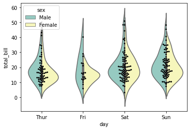
The hue parameter specifies the variable that we want to use to split the violins. In this case, we want to split the violins by the gender of the person who paid the bill. Seaborn creates a separate violin for each combination of day of the week and gender.
We can also add a swarm plot to the violin chart to show the individual data points:
sns.violinplot(x="day", y="total_bill", data=tips, palette="Set3", hue="sex", split=True)
sns.swarmplot(x="day", y="total_bill", data=tips, color="black", size=3)
The split parameter in the violinplot() function splits the violins for each combination of categories in the x and hue variables. The swarmplot() function adds a swarm plot to the chart, which shows the individual data points.
In addition to the violinplot() function, Seaborn also provides other functions for creating violin charts, including catplot() and boxenplot(). The catplot() function is a high-level interface that can create various types of categorical plots, including violin charts. The boxenplot() function is a variation of the violin chart that uses boxes instead of violins to show the density of the data.
In summary, Seaborn is a powerful library for creating violin charts in Python. Violin charts are a useful tool for visualizing the distribution of continuous data across different categories. By using Seaborn’s various functions and parameters, we can create aesthetically pleasing violin charts that provide insights into our data.
Latest end-to-end Learn by Coding Projects (Jupyter Notebooks) in Python and R:
All Notebooks in One Bundle: Data Science Recipes and Examples in Python & R.
End-to-End Python Machine Learning Recipes & Examples.
End-to-End R Machine Learning Recipes & Examples.
Applied Statistics with R for Beginners and Business Professionals
Data Science and Machine Learning Projects in Python: Tabular Data Analytics
Data Science and Machine Learning Projects in R: Tabular Data Analytics
Python Machine Learning & Data Science Recipes: Learn by Coding
R Machine Learning & Data Science Recipes: Learn by Coding
Comparing Different Machine Learning Algorithms in Python for Classification (FREE)
There are 2000+ End-to-End Python & R Notebooks are available to build Professional Portfolio as a Data Scientist and/or Machine Learning Specialist. All Notebooks are only $29.95. We would like to request you to have a look at the website for FREE the end-to-end notebooks, and then decide whether you would like to purchase or not.