Free eBooks for Beginners
Excel charts are a great way for data analysts to visually present information and insights from a large set of data. One type of chart that is particularly useful for summarizing data is the Whisker Chart.
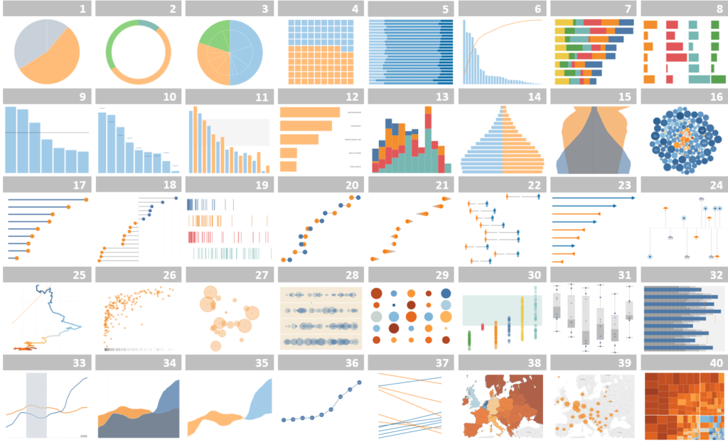
A Whisker Chart, also known as a Box-and-Whisker Plot, is a type of chart that shows the distribution of a set of numerical data by dividing it into quarters. It gives a quick visual representation of the range, median, and outliers in a dataset.
To create a Whisker Chart in Excel, you start by selecting the data you want to use and then going to the Insert tab and choosing the Whisker Chart option. You will then see a box in the center of the chart, which represents the middle 50% of the data. This box is referred to as the “box.”
The top of the box represents the upper quartile of the data, which is the point where 75% of the data falls below it. The bottom of the box represents the lower quartile, which is the point where 25% of the data falls below it. The line in the center of the box represents the median, which is the midpoint of the data.
The two lines that extend out from the box are referred to as “whiskers.” The upper whisker represents the highest value in the data that is within 1.5 times the interquartile range (the distance between the upper and lower quartiles). The lower whisker represents the lowest value in the data that is within 1.5 times the interquartile range.
Any data points outside of the whiskers are considered outliers and are shown as individual points on the chart. This makes it easy to see if there are any data points that are significantly different from the rest of the data.
In conclusion, Whisker Charts are a great way to quickly visualize the distribution of a large set of data. They provide information about the range, median, and outliers in a dataset, making it easy for data analysts to identify patterns and make informed decisions based on the information presented.
Excel Charts for Data Analyst : Tutorial 12 – Whisker Chart
 Loading...
Disclaimer: The information and code presented within this recipe/tutorial is only for educational and coaching purposes for beginners and developers. Anyone can practice and apply the recipe/tutorial presented here, but the reader is taking full responsibility for his/her actions. The author (content curator) of this recipe (code / program) has made every effort to ensure the accuracy of the information was correct at time of publication. The author (content curator) does not assume and hereby disclaims any liability to any party for any loss, damage, or disruption caused by errors or omissions, whether such errors or omissions result from accident, negligence, or any other cause. The information presented here could also be found in public knowledge domains.