Free eBooks for Beginners
Excel is a powerful tool that is widely used by data analysts to manage, analyze, and visualize data. One of the most powerful features in Excel is its charting capability, which allows you to create visually appealing and informative charts that help to communicate your data in an effective way.
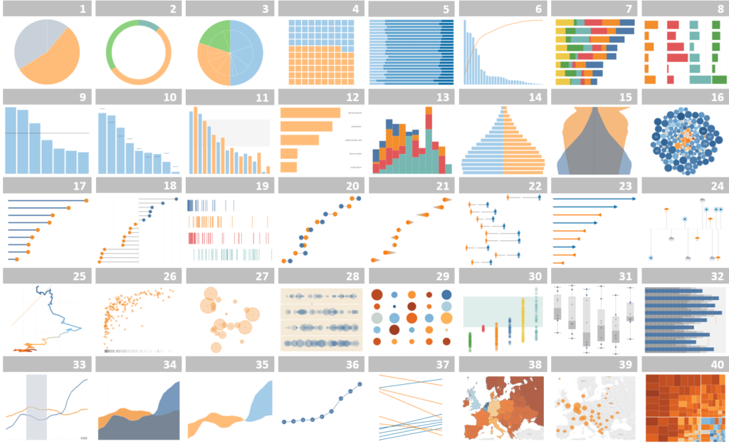
There are many different types of charts that you can create in Excel, including bar charts, line charts, pie charts, and scatter plots. Each type of chart is designed to help you visualize different types of data in different ways. For example, bar charts are often used to compare the size of different data sets, while line charts are used to show changes in data over time.
One of the key advantages of using Excel charts is that they are easy to create and customize. You simply select the data you want to chart, and then choose the type of chart you want to create. Excel will then automatically generate the chart, and you can customize it further by changing the colors, adding labels, and modifying the axis scales.
Another advantage of using Excel charts is that they can help you to uncover patterns and trends in your data that might not be immediately apparent. For example, you might use a scatter plot to identify the relationship between two variables, or you might use a line chart to track changes in data over time. By visualizing your data in different ways, you can gain new insights into your data that can help you make better decisions.
In conclusion, Excel charts are a powerful tool for data analysts who want to communicate their data in an effective and visually appealing way. There are many different types of charts to choose from, and they are easy to create and customize. By using Excel charts, you can uncover patterns and trends in your data that might not be immediately apparent, and make better decisions based on your data. Whether you are a beginner or an experienced data analyst, using Excel charts is a must-have skill that will help you to be more effective and efficient in your work.
Excel Charts for Data Analyst : Tutorial 01
 Loading...
Disclaimer: The information and code presented within this recipe/tutorial is only for educational and coaching purposes for beginners and developers. Anyone can practice and apply the recipe/tutorial presented here, but the reader is taking full responsibility for his/her actions. The author (content curator) of this recipe (code / program) has made every effort to ensure the accuracy of the information was correct at time of publication. The author (content curator) does not assume and hereby disclaims any liability to any party for any loss, damage, or disruption caused by errors or omissions, whether such errors or omissions result from accident, negligence, or any other cause. The information presented here could also be found in public knowledge domains.