Data Analyst’s Recipe | How to create a scatter plot in MATLAB

Creating a scatter plot in MATLAB is a useful way to visualize the relationship between two continuous variables. In this tutorial, we will walk through the steps to create a scatter plot in MATLAB and explore the UCI dataset as an example.
Loading the data
First, we need to load the data that we want to use for our scatter plot. For this tutorial, we will be using the iris dataset which is included in the datasets package in MATLAB.
% Load the iris dataset
load fisheriris
Creating a scatter plot using scatter function
Next, we will create a scatter plot using the scatter() function in MATLAB. We will use the scatter() function to create the basic plot object and then add layers to customise the plot.
% Create a basic scatter plot
scatter(meas(:,1), meas(:,2))
xlabel('Sepal Length')
ylabel('Sepal Width')
title('Sepal Length vs. Sepal Width')
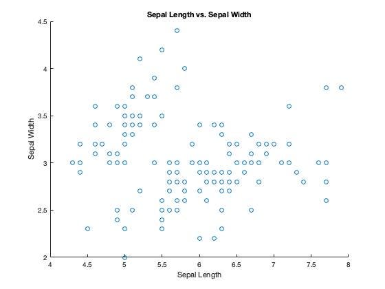
In the above code, we first loaded the fisheriris dataset using the load() function. Then, we created a basic scatter plot using the scatter() function and specified the meas(:,1) and meas(:,2) as the variables to be plotted on the x and y axes respectively. Finally, we added the x and y axis labels, and a title to the plot using the xlabel(), ylabel() and title() functions.
Customizing the scatter plot
Now that we have created a basic scatter plot, we can customize it to make it more visually appealing and informative. Here are a few examples:
Changing the colour of the points based on a third variable
% Create a scatter plot with points colored by species
gscatter(meas(:,1), meas(:,2), species)
xlabel('Sepal Length')
ylabel('Sepal Width')
title('Sepal Length vs. Sepal Width')
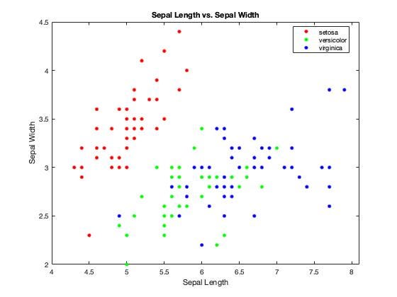
In the above code, we used the gscatter() function to create a scatter plot where the points are colored by the species variable. This creates a scatter plot where each species is represented by a different color.
Adding a regression line
% Create a scatter plot with a regression line
scatter(meas(:,1), meas(:,2))
xlabel('Sepal Length')
ylabel('Sepal Width')
title('Sepal Length vs. Sepal Width')
hold on
mdl = fitlm(meas(:,1), meas(:,2));
plot(mdl)
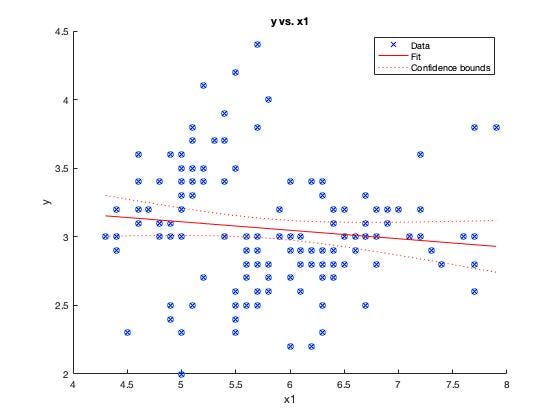
In the above code, we first created a basic scatter plot. Then, we used the fitlm() function to create a linear regression model of meas(:,1) vs. meas(:,2). Finally, we added the regression line to the plot using the plot() function.
Latest end-to-end Learn by Coding Projects (Jupyter Notebooks) in Python and R:
All Notebooks in One Bundle: Data Science Recipes and Examples in Python & R.
End-to-End Python Machine Learning Recipes & Examples.
End-to-End R Machine Learning Recipes & Examples.
Applied Statistics with R for Beginners and Business Professionals
Data Science and Machine Learning Projects in Python: Tabular Data Analytics
Data Science and Machine Learning Projects in R: Tabular Data Analytics
Python Machine Learning & Data Science Recipes: Learn by Coding
R Machine Learning & Data Science Recipes: Learn by Coding
Comparing Different Machine Learning Algorithms in Python for Classification (FREE)
There are 2000+ End-to-End Python & R Notebooks are available to build Professional Portfolio as a Data Scientist and/or Machine Learning Specialist. All Notebooks are only $29.95. We would like to request you to have a look at the website for FREE the end-to-end notebooks, and then decide whether you would like to purchase or not.