GGPLOT AXIS TICKS: SET AND ROTATE TEXT LABELS
This article describes how to easily set ggplot axis ticks for both x and y axes. We’ll also explain how to rotate axis labels by specifying a rotation angle.
In this R graphics tutorial, you will learn how to:
- Change the font style (size, color and face) of the axis tick mark labels.
- Rotate axis text labels. For example, for a vertical x axis text label you can specify the argument angle as follow:
p + theme(axis.text.x = element_text(angle = 90)). - Remove axis ticks mark and text:
p + theme(axis.text.x = element_blank(), axis.ticks = element_blank()). - Remove grid lines and customize axis lines.
- Customize axis ticks for discrete and continuous axes:
- Manually label / rename tick marks and change the order of items in the plot for a discrete x axis.
- Format continuous axis tick labels using
percent,dollarandscientificscale transformations. - Change the axis ticks interval (or breaks) by specifying custom values.
Contents:
- Key ggplot2 R functions
- Example of plots
- Change axis tick mark labels
- Remove x and y axis tick mark labels
- Change axis lines
- Customize continuous and discrete axes
- Discrete axes
- Continuous axes
- Conclusion
Key ggplot2 R functions
- Main functions:
The following function will be used to modify the axis theme and scale:
- theme(axis.text.x = element_text(), axis.text.y = element_text()). Change the appearance of axes text.
- theme(axis.line = element_line()). Change the axis lines
- scale_x_discrete() and scale_y_discrete(). Customize discrete x and y axes, respectively.
- scale_x_continuous() and scale_y_continuous(). Customize continuous x and y axes, respectively.
The scale functions take the arguments breaks, labels and limits as inputs.
- Key ggplot2 theme options to modify the axis line, axis ticks and tick text labels:
theme(
  # Change axis lines
  axis.line = element_line(),

  # Change axis ticks text labels: font color, size and face
  axis.text = element_text(),       # Change tick labels for all axes
  axis.text.x = element_text(),     # Change x axis tick labels only
  axis.text.x.top = element_text(), # x axis tick labels on top axis
  axis.text.y = element_text(),     # Change y axis tick labels only
  axis.text.y.right = element_text(),# y  axis tick labels on top axis

  # Change axis ticks line: font color, size, linetype and length
  axis.ticks = element_line(),      # Change ticks line fo all axes
  axis.ticks.x = element_line(),    # Change x axis ticks only
  axis.ticks.y = element_line(),    # Change y axis ticks only
  axis.ticks.length = unit(3, "pt") # Change the length of tick marks
)
Arguments of the helper functions:
element_text(color, size, face, family, angle, hjust, vjust). Modify the appearance and the rotation angle of axis texts.element_line(color, size, linetype). Modify the appearance of line elements.unit(). Change axis ticks length. Example: unit(4, “pt”).
To remove a particular axis text or ticks, use element_blank() for the corresponding theme argument. For example to remove all axis ticks, use this: p + theme(axis.ticks = element_blank()).
Example of plots
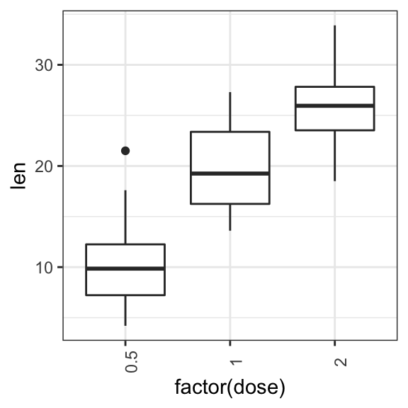
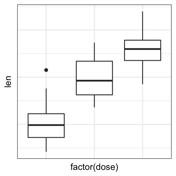
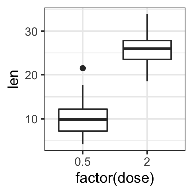
Start by creating a box plot using the ToothGrowth data set:
library(ggplot2)
p <- ggplot(ToothGrowth, aes(x = factor(dose), y = len)) +
  geom_boxplot()
p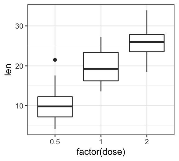
Change axis tick mark labels
The functions theme() and element_text() are used to set the font size, color and face of axis tick mark labels. You can also specify the argument angle in the function element_text() to rotate the tick text.
Change the style and the orientation angle of axis tick labels. For a vertical rotation of x axis labels use angle = 90.
# Rotate x and y axis text by 45 degree
# face can be "plain", "italic", "bold" or "bold.italic"
p + theme(axis.text.x = element_text(face = "bold", color = "#993333",
                           size = 12, angle = 45),
          axis.text.y = element_text(face = "bold", color = "blue",
                           size = 12, angle = 45))

# Vertical rotation of x axis text
p + theme(axis.text.x = element_text(angle = 90))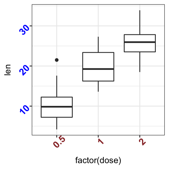
To adjust the position of the axis text, you can specify the argument hjust and vjust, which values should be comprised between 0 and 1. For example:
# Create a new simple box plot
p2 <- ggplot(iris, aes(Species, Sepal.Length)) +
  geom_boxplot()

# Rotated but not adjusted x axis text
p2 + theme(axis.text.x = element_text(angle = 45))

# Rotate and adjust x axis text
p2 + theme(axis.text.x = element_text(angle = 45, hjust = 1))

Remove x and y axis tick mark labels
Key function: element_blank()
# Remove x and y axis tick mark labels
p + theme(
  axis.text.x = element_blank(),
  axis.text.y = element_blank())

# Remove axis ticks and tick mark labels
p + theme(
  axis.text.x = element_blank(),
  axis.text.y = element_blank(),
  axis.ticks = element_blank())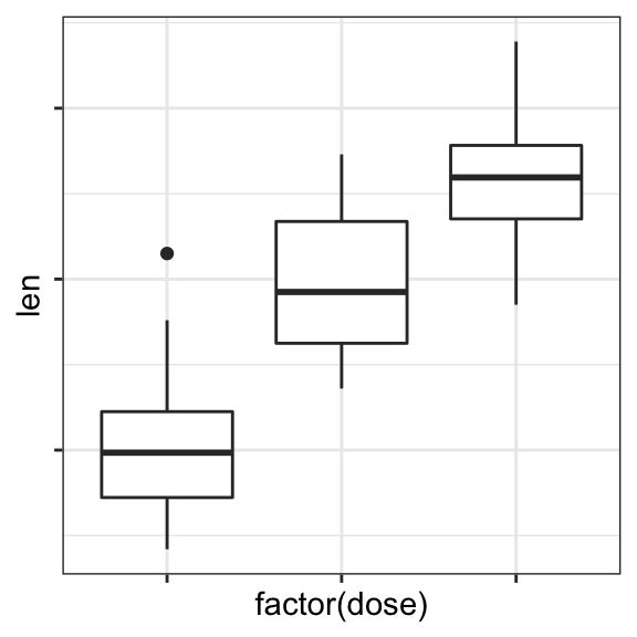
Change axis lines
- Key function:
theme()andelement_line() - Allowed values for line types: (“blank”, “solid”, “dashed”, “dotted”, “dotdash”, “longdash”, “twodash”) or number (0, 1, 2, 3, 4, 5, 6).
linetype = "solid"is identical tolinetype = 1.
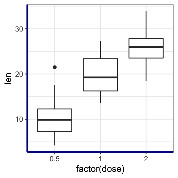
Change the color, the size and the line type of axis lines:
p + theme(
  axis.line = element_line(color = "darkblue",
                           size = 1, linetype = "solid")
  )
Customize continuous and discrete axes
x or y axis can be discrete (grouping variable) or continuous (numeric variable). In each of these two cases, the functions to be used for setting axis ticks are different.
Key ggplot2 R functions:
- Discrete axes:
- scale_x_discrete(name, breaks, labels, limits): for x axis
- scale_y_discrete(name, breaks, labels, limits): for y axis
- Continuous axes:
- scale_x_continuous(name, breaks, labels, limits, trans): for x axis
- scale_y_continuous(name, breaks, labels, limits, trans): for x axis
Function arguments definition:
name: x or y axis labelsbreaks: vector specifying which breaks to displaylabels: labels of axis tick markslimits: vector indicating the data range
The scale_xx() functions can be used to change the following x or y axis parameters :
- axis titles or labels
- axis limits (data range to display)
- choose where tick marks appear
- manually label tick marks
Discrete axes
In the examples below, we’ll use only the functions scale_x_discrete() and xlim() to customize x axis tick marks. The same type of examples can be applied to a discrete y axis using the functions scale_y_discrete() and ylim().
# Change x axis label and the order of items
p + scale_x_discrete(name ="Dose (mg)",
limits=c("2","1","0.5"))
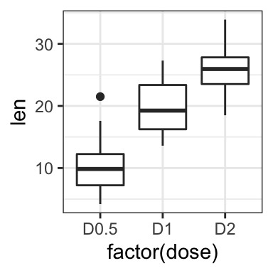
# Rename / Change tick mark labels
p + scale_x_discrete(breaks=c("0.5","1","2"),
labels=c("D0.5", "D1", "D2"))
# Choose which items to display
p + scale_x_discrete(limits=c("0.5", "2"))
# or use this:
# p + xlim("0.5", "2") # same as above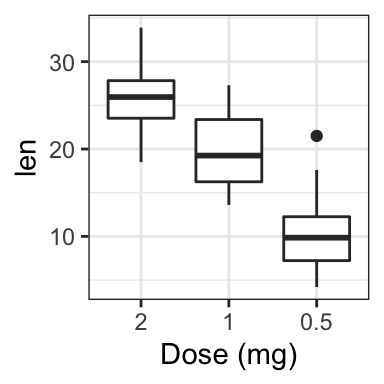
Continuous axes
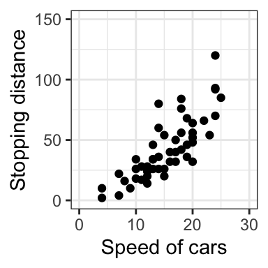
- Create a simple scatter plot
- Change axis labels and limits. Break axis by a user defined value.
# Simple scatter plot
sp <- ggplot(cars, aes(x = speed, y = dist)) + geom_point()
sp


# Change x and y axis labels, and limits
sp + scale_x_continuous(name="Speed of cars", limits=c(0, 30)) +
  scale_y_continuous(name="Stopping distance", limits=c(0, 150))
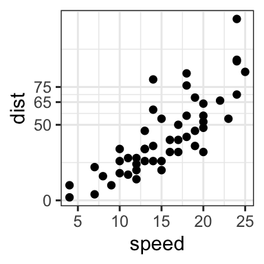
- Change axis ticks interval:
# Break y axis by a specified value
# a tick mark is shown on every 50
sp + scale_y_continuous(breaks=seq(0, 150, 50))

# Tick marks can be spaced randomly
sp + scale_y_continuous(breaks=c(0, 50, 65, 75, 150))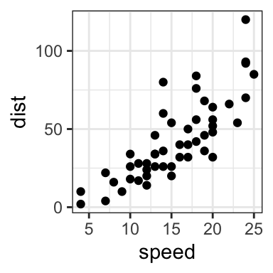
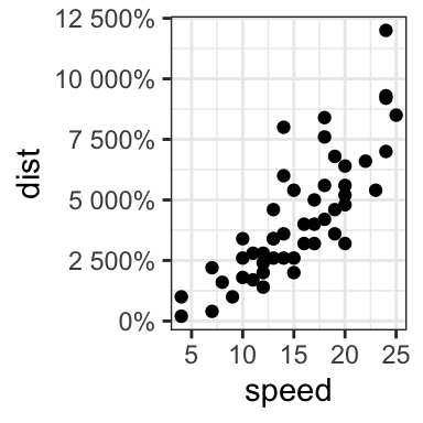
- Remove tick mark labels and gridlines
- Format axis tick labels. Possible values for labels are comma, percent, dollar and scientific. For more examples, read the documentation of the function trans_new() in the
scalesR package.
# Remove y tick mark labels and grid lines
sp + scale_y_continuous(breaks=NULL)

# Format y axis labels in percent (%)
require(scales)
sp + scale_y_continuous(labels = percent) 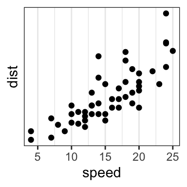
For dollar and scientific formats, type this:
require(scales)

# Dollar
p + scale_y_continuous(labels = dollar)

# Scientific
p + scale_y_continuous(labels = scientific)
Conclusion
- Create an example of ggplot:
library(ggplot2)
p <- ggplot(iris, aes(Species, Sepal.Length)) +
geom_boxplot()- Change tick font:
# Change tick text for both x and y axis
p + theme(
  axis.text = element_text(size = 11, color = "blue")
)
# Change tick text for x axis ony
p + theme(axis.text.x = element_text(color = "blue", face = "italic"))- Rotate x axis text:
# Vertical rotation: 90 degree
p + theme(
  axis.text.x = element_text(angle = 90, hjust = 1, vjust = 0.5)
)
# Rotate by 45 degree
p + theme(
  axis.text.x = element_text(angle = 45, hjust = 1)
)- Remove x axis ticks and rename tick labels:
p + theme(axis.ticks.x = element_blank())+
  scale_x_discrete(
    breaks=c("setosa","versicolor","virginica"),
    labels=c("SE", "VE", "VI")
    )
Python Example for Beginners

Two Machine Learning Fields
There are two sides to machine learning:
- Practical Machine Learning:This is about querying databases, cleaning data, writing scripts to transform data and gluing algorithm and libraries together and writing custom code to squeeze reliable answers from data to satisfy difficult and ill defined questions. It’s the mess of reality.
- Theoretical Machine Learning: This is about math and abstraction and idealized scenarios and limits and beauty and informing what is possible. It is a whole lot neater and cleaner and removed from the mess of reality.
Data Science Resources: Data Science Recipes and Applied Machine Learning Recipes
Introduction to Applied Machine Learning & Data Science for Beginners, Business Analysts, Students, Researchers and Freelancers with Python & R Codes @ Western Australian Center for Applied Machine Learning & Data Science (WACAMLDS) !!!
Latest end-to-end Learn by Coding Recipes in Project-Based Learning:
Applied Statistics with R for Beginners and Business Professionals
Data Science and Machine Learning Projects in Python: Tabular Data Analytics
Data Science and Machine Learning Projects in R: Tabular Data Analytics
Python Machine Learning & Data Science Recipes: Learn by Coding
R Machine Learning & Data Science Recipes: Learn by Coding
Comparing Different Machine Learning Algorithms in Python for Classification (FREE)
Disclaimer: The information and code presented within this recipe/tutorial is only for educational and coaching purposes for beginners and developers. Anyone can practice and apply the recipe/tutorial presented here, but the reader is taking full responsibility for his/her actions. The author (content curator) of this recipe (code / program) has made every effort to ensure the accuracy of the information was correct at time of publication. The author (content curator) does not assume and hereby disclaims any liability to any party for any loss, damage, or disruption caused by errors or omissions, whether such errors or omissions result from accident, negligence, or any other cause. The information presented here could also be found in public knowledge domains.