GGPLOT AXIS LIMITS AND SCALES
This article describes R functions for changing ggplot axis limits (or scales). We’ll describe how to specify the minimum and the maximum values of axes.
Among the different functions available in ggplot2 for setting the axis range, the coord_cartesian() function is the most preferred, because it zoom the plot without clipping the data.
In this R graphics tutorial, you will learn how to:
- Change axis limits using
coord_cartesian(),xlim(),ylim()and more. - Set the intercept of x and y axes at zero (0,0).
- Expand the plot limits to ensure that limits include a single value for all plots or panels.
Contents:
- Key ggplot2 R functions
- Change axis limits
- Use coord_cartesian
- Use xlim and ylim
- Use scale_x_continuous and scale_y_continuous
- Expand plot limits
- Conclusion
Key ggplot2 R functions
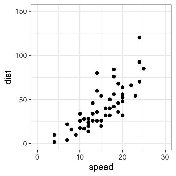
Start by creating a scatter plot using the cars data set:
library(ggplot2)
p <- ggplot(cars, aes(x = speed, y = dist)) +
  geom_point()
3 Key functions are available to set the axis limits and scales:
- Without clipping (preferred). Cartesian coordinates. The Cartesian coordinate system is the most common type of coordinate system. It will zoom the plot, without clipping the data.
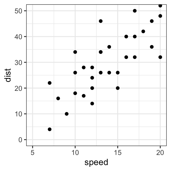
p + coord_cartesian(xlim = c(5, 20), ylim = c(0, 50))- With clipping the data (removes unseen data points). Observations not in this range will be dropped completely and not passed to any other layers.
# Use this
p + scale_x_continuous(limits = c(5, 20)) +
  scale_y_continuous(limits = c(0, 50))

# Or this shothand functions
p + xlim(5, 20) + ylim(0, 50)
Note that, scale_x_continuous() and scale_y_continuous() remove all data points outside the given range and, the coord_cartesian() function only adjusts the visible area.
In most cases you would not see the difference, but if you fit anything to the data the functions scale_x_continuous() / scale_y_continuous() would probably change the fitted values.
- Expand the plot limits to ensure that a given value is included in all panels or all plots.
# set the intercept of x and y axes at (0,0)
p + expand_limits(x = 0, y = 0)

# Expand plot limits
p + expand_limits(x = c(5, 50), y = c(0, 150))
Change axis limits
Use coord_cartesian
Most common coordinate system (preferred). Zoom the plot.
# Default plot
print(p)

# Change axis limits using coord_cartesian()
p + coord_cartesian(xlim =c(5, 20), ylim = c(0, 50))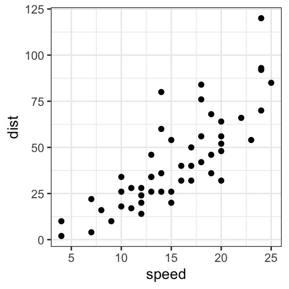
Use xlim and ylim
- p + xlim(min, max): change x axis limits
- p + ylim(min, max): change y axis limits
Any values outside the limits will be replaced by NA and dropped.
p + xlim(5, 20) + ylim(0, 50)Use scale_x_continuous and scale_y_continuous
Can be used to change, at the same time, the axis scales and labels, respectively:
p + scale_x_continuous(name = "Speed of cars", limits = c(0, 30)) +
  scale_y_continuous(name = "Stopping distance", limits = c(0, 150))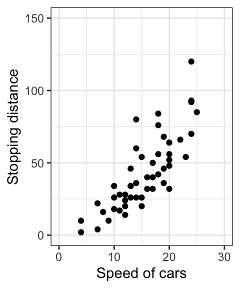
Expand plot limits
Key function expand_limits(). Can be used to :
- quickly set the intercept of x and y axes at (0,0)
- expand the limits of x and y axes
# set the intercept of x and y axis at (0,0)
p + expand_limits(x = 0, y = 0)

# change the axis limits
p + expand_limits(x=c(0,30), y=c(0, 150))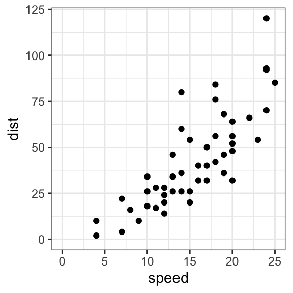
Conclusion
- Create an example of ggplot:
library(ggplot2)
p <- ggplot(cars, aes(x = speed, y = dist)) +
geom_point()- Set a ggplot axis limits:
p + coord_cartesian(xlim = c(5, 20), ylim = (0, 50))- Set the intercept of x and y axis at zero (0, 0) coordinates:
p + expand_limits(x = 0, y = 0)
Python Example for Beginners
Two Machine Learning Fields
There are two sides to machine learning:
- Practical Machine Learning:This is about querying databases, cleaning data, writing scripts to transform data and gluing algorithm and libraries together and writing custom code to squeeze reliable answers from data to satisfy difficult and ill defined questions. It’s the mess of reality.
- Theoretical Machine Learning: This is about math and abstraction and idealized scenarios and limits and beauty and informing what is possible. It is a whole lot neater and cleaner and removed from the mess of reality.
Data Science Resources: Data Science Recipes and Applied Machine Learning Recipes
Introduction to Applied Machine Learning & Data Science for Beginners, Business Analysts, Students, Researchers and Freelancers with Python & R Codes @ Western Australian Center for Applied Machine Learning & Data Science (WACAMLDS) !!!
Latest end-to-end Learn by Coding Recipes in Project-Based Learning:
Applied Statistics with R for Beginners and Business Professionals
Data Science and Machine Learning Projects in Python: Tabular Data Analytics
Data Science and Machine Learning Projects in R: Tabular Data Analytics
Python Machine Learning & Data Science Recipes: Learn by Coding
R Machine Learning & Data Science Recipes: Learn by Coding
Comparing Different Machine Learning Algorithms in Python for Classification (FREE)
Disclaimer: The information and code presented within this recipe/tutorial is only for educational and coaching purposes for beginners and developers. Anyone can practice and apply the recipe/tutorial presented here, but the reader is taking full responsibility for his/her actions. The author (content curator) of this recipe (code / program) has made every effort to ensure the accuracy of the information was correct at time of publication. The author (content curator) does not assume and hereby disclaims any liability to any party for any loss, damage, or disruption caused by errors or omissions, whether such errors or omissions result from accident, negligence, or any other cause. The information presented here could also be found in public knowledge domains.