Introduction
Data is the new oil in the digital age, and just like oil, it needs to be refined to extract its true value. With the exponential growth in data, summarizing it to extract meaningful insights is becoming increasingly important. Data summarization is a process that involves reducing raw data into its main constituents or features, making it easier to understand, visualize, and analyze.
This article provides an in-depth exploration of seven important ways to summarize data, each method adding a layer of understanding that can help drive strategic decisions.
1. Central Tendency: Mean, Median, Mode
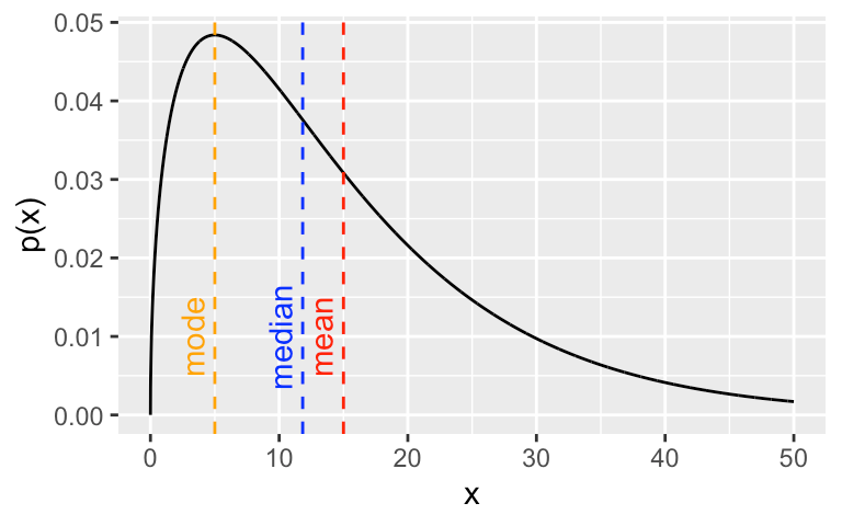
The central tendency is a statistical measure that identifies a single value as representative of an entire distribution. It aims to provide an accurate depiction of a ‘typical’ data point within the dataset. The three primary measures of central tendency are the mean, median, and mode.
Mean: The mean is calculated by adding all the data points in a dataset and then dividing by the number of data points. The mean represents the ‘average’ value of the dataset.
Median: The median is the middle point of a dataset. To find the median, the data must first be sorted in order of magnitude (either ascending or descending). If the dataset contains an odd number of observations, the middle value is the median. If there’s an even number of observations, the median is the average of the two middle numbers.
Mode: The mode is the most frequently occurring value in a dataset. A dataset may have one mode (unimodal), two modes (bimodal), or multiple modes (multimodal).
Understanding the central tendency helps to establish a ‘typical’ value, serving as a useful summary of the data.
2. Dispersion: Range, Variance, Standard Deviation
While measures of central tendency provide a summary of typical values, measures of dispersion describe the spread of data points. They provide insight into the variability within a dataset. Key measures of dispersion include the range, variance, and standard deviation.
Range: The range is the simplest measure of dispersion. It’s calculated by subtracting the smallest value from the largest value in a dataset.
Variance: Variance is a measure of how much the data points in a dataset differ from the mean. It’s calculated by taking the average of the squared differences from the mean.
Standard Deviation: The standard deviation is the square root of the variance. It’s a measure of the average distance between each data point and the mean. It’s particularly useful because it’s expressed in the same units as the data, which simplifies interpretation.
Understanding dispersion is crucial to gauging the reliability of your data. A high dispersion indicates a high degree of variability in the data, which may suggest a need for further investigation.
3. Skewness and Kurtosis
Skewness and Kurtosis are two important measures of the shape of a data distribution.
Skewness: Skewness measures the asymmetry of a data distribution. A positive skew indicates a distribution with a long right tail, while a negative skew indicates a distribution with a long left tail. A skewness of zero suggests a perfectly symmetrical distribution.
Kurtosis: Kurtosis measures the ‘tailedness’ of a distribution. High kurtosis indicates a distribution with heavy tails and a sharp peak (leptokurtic), while low kurtosis indicates a distribution with light tails and a flat peak (platykurtic). A normal distribution has a kurtosis of zero (mesokurtic).
Understanding the skewness and kurtosis of your data distribution can provide valuable insights into the nature of the variability of your data. Skewness can indicate potential outliers or anomalies in your data, while kurtosis can suggest whether your data has heavy or light tails, which can impact certain statistical analyses.
4. Correlation and Covariance
Correlation and covariance are two measures that describe the relationship between two variables in a dataset.
Correlation: Correlation measures the strength and direction of a linear relationship between two variables. It ranges from -1 to 1, where 1 indicates a perfect positive relationship, -1 indicates a perfect negative relationship, and 0 indicates no linear relationship.
Covariance: Covariance is a measure of how much two variables vary together. Unlike correlation, covariance does not measure the strength of the relationship, and its value is not constrained, making it less interpretable than correlation.
These two measures are crucial for understanding the relationships between different variables in your data, which can help in predictive modeling and other statistical analyses.
5. Percentiles and Quartiles
Percentiles and quartiles are measures of relative standing that can provide a deeper understanding of your dataset’s distribution.
Percentiles: A percentile indicates the value below which a given percentage of observations in a dataset falls. For example, the 20th percentile is the value below which 20% of the observations may be found.
Quartiles: Quartiles divide a rank-ordered dataset into four equal parts. The first quartile (Q1) is the 25th percentile, the second quartile (Q2) is the median or 50th percentile, and the third quartile (Q3) is the 75th percentile.
Percentiles and quartiles are particularly useful for understanding the distribution of your data, identifying outliers, and comparing different data points or datasets.
6. Box Plots and Histograms
Box plots and histograms are graphical methods for summarizing data.
Box Plots: A box plot (or box-and-whisker plot) provides a visual summary of the minimum, first quartile, median, third quartile, and maximum in a dataset. It can also indicate outliers within the data. Box plots are excellent for comparing distributions between different groups.
Histograms: A histogram is a graphical representation of the distribution of a dataset. It’s an estimate of the probability distribution of a continuous variable. Histograms provide a visual interpretation of numerical data by indicating the number of data points that lie within a range of values, called bins.
These graphical methods allow for a quick, visual understanding of the data, making them a valuable tool for data analysis.
7. Cross Tabulation
Cross tabulation (or cross-tab) is a method of summarizing categorical data. It creates a contingency table that shows the frequency distribution of the variables. Cross-tabulation allows for observing the statistical significance of the relationship between two or more categorical variables.
Cross tabs are especially useful in market research or any other research that uses surveys or questionnaires. They provide a basic picture of the interrelation between two or more variables and can help find interactions between them.
Conclusion
Summarizing data is a crucial step in the data analysis process. It provides a comprehensive understanding of the dataset, revealing patterns, relationships, and insights that may not be apparent in raw, unprocessed data. The seven methods described in this article — measures of central tendency, dispersion, skewness and kurtosis, correlation and covariance, percentiles and quartiles, box plots and histograms, and cross-tabulation — each offer different perspectives on the data, providing a well-rounded summary that can inform decision-making.